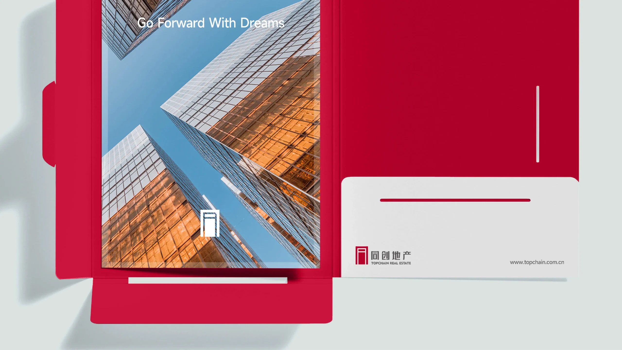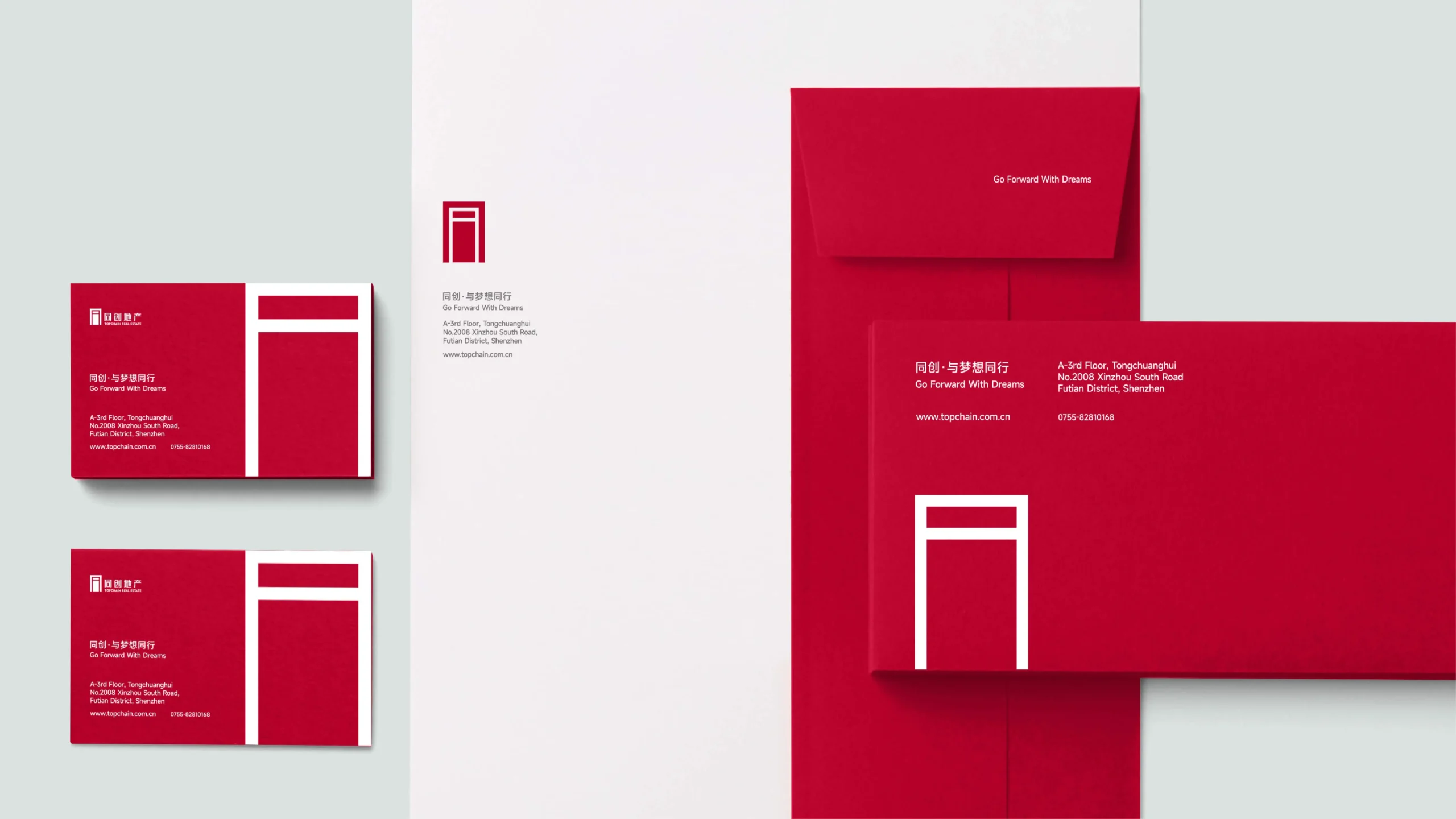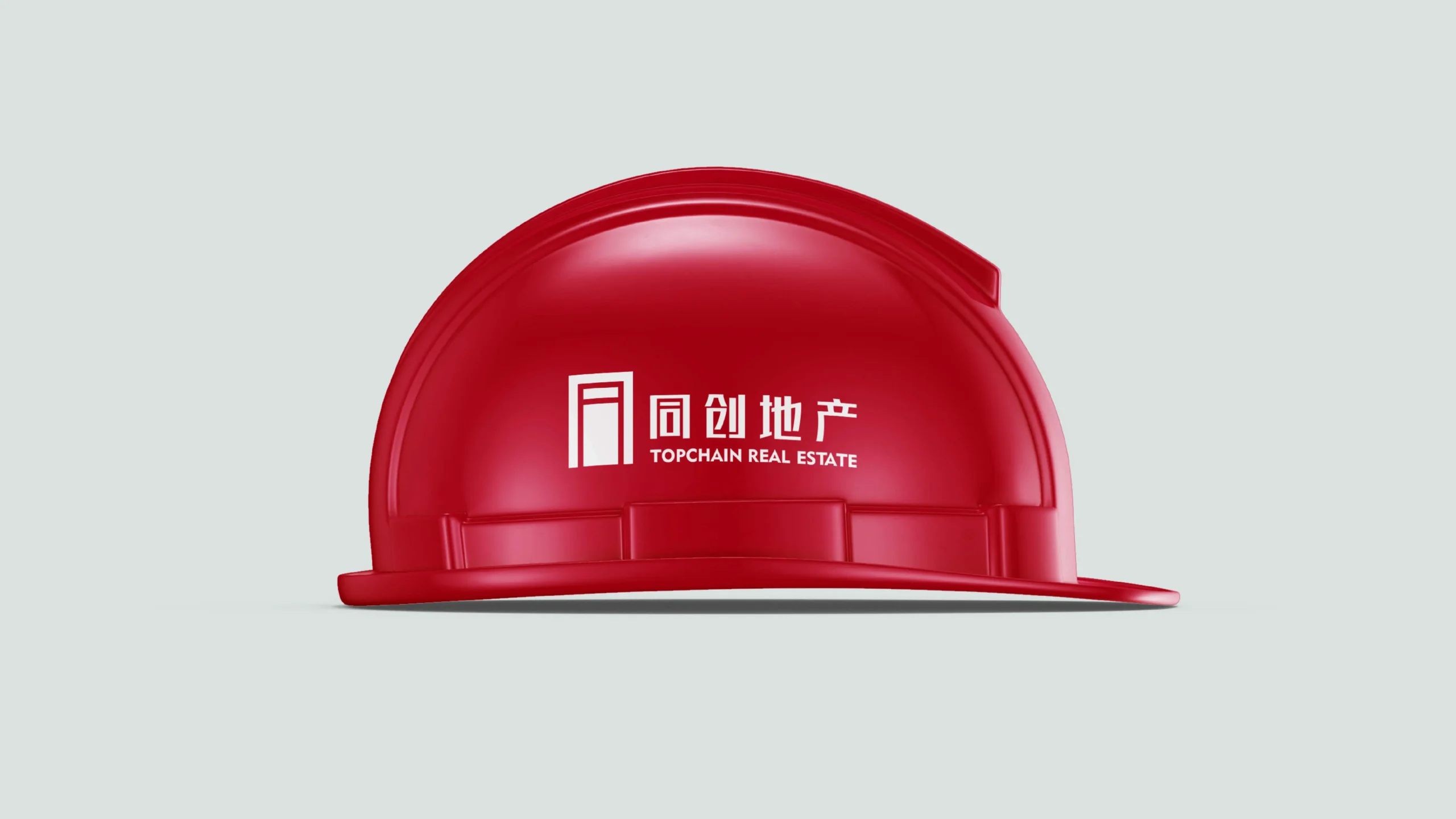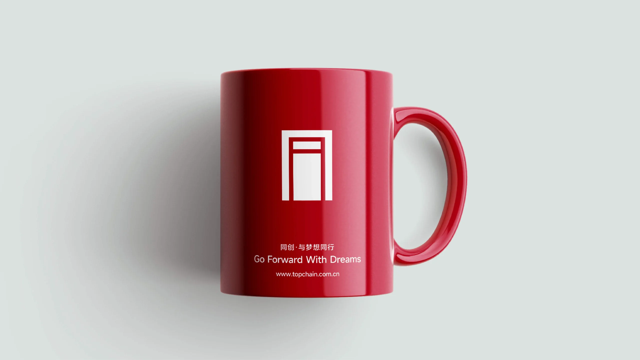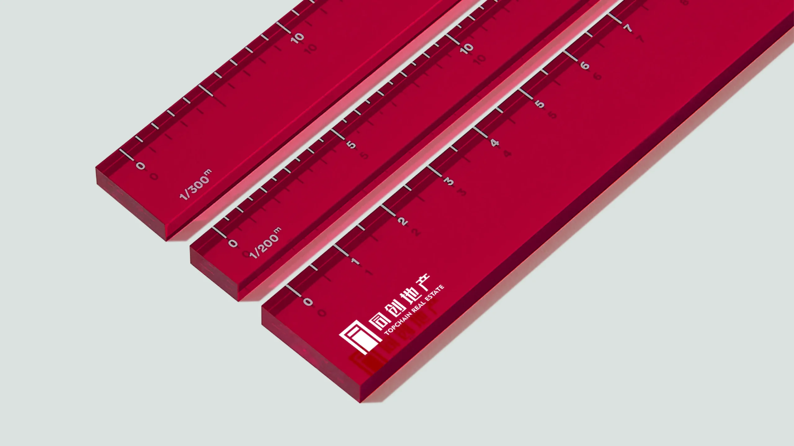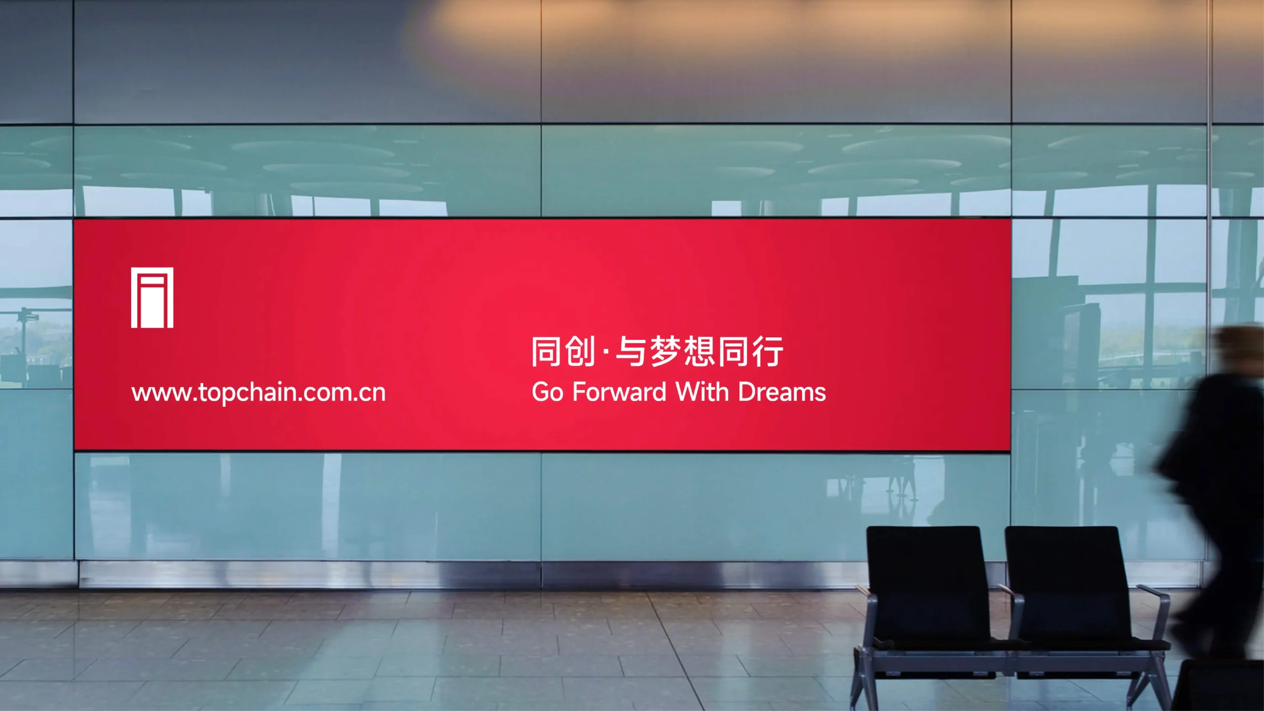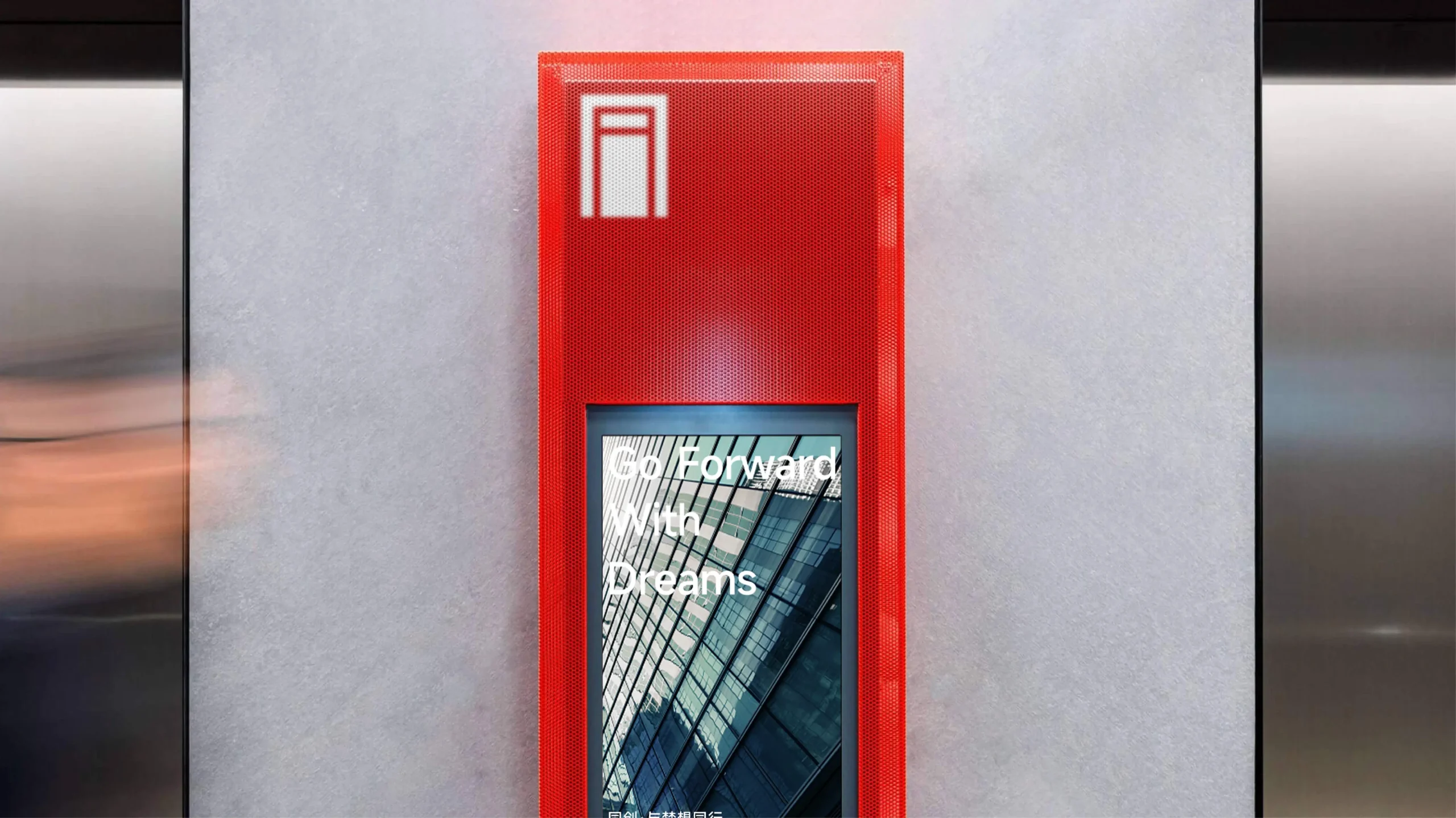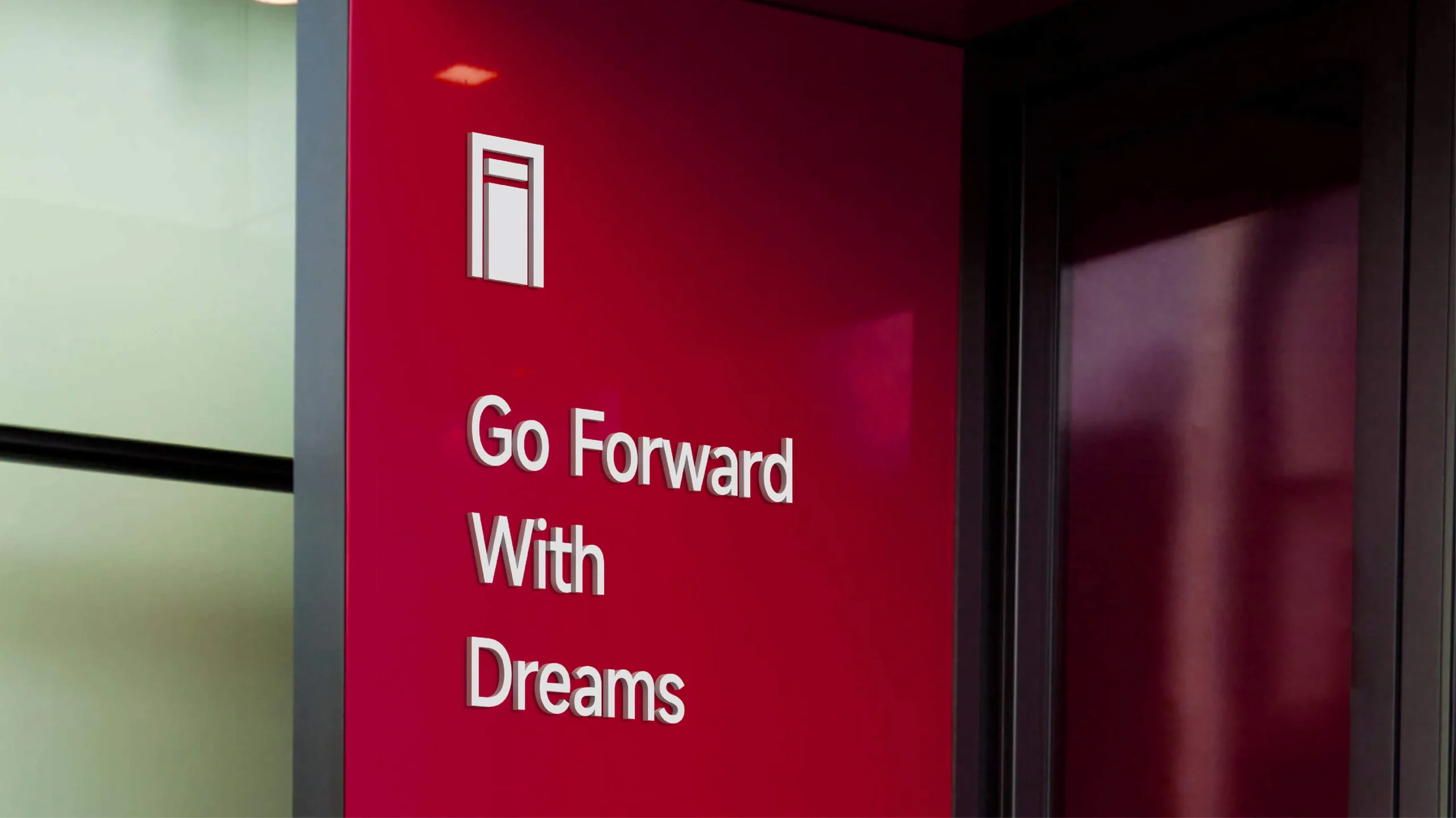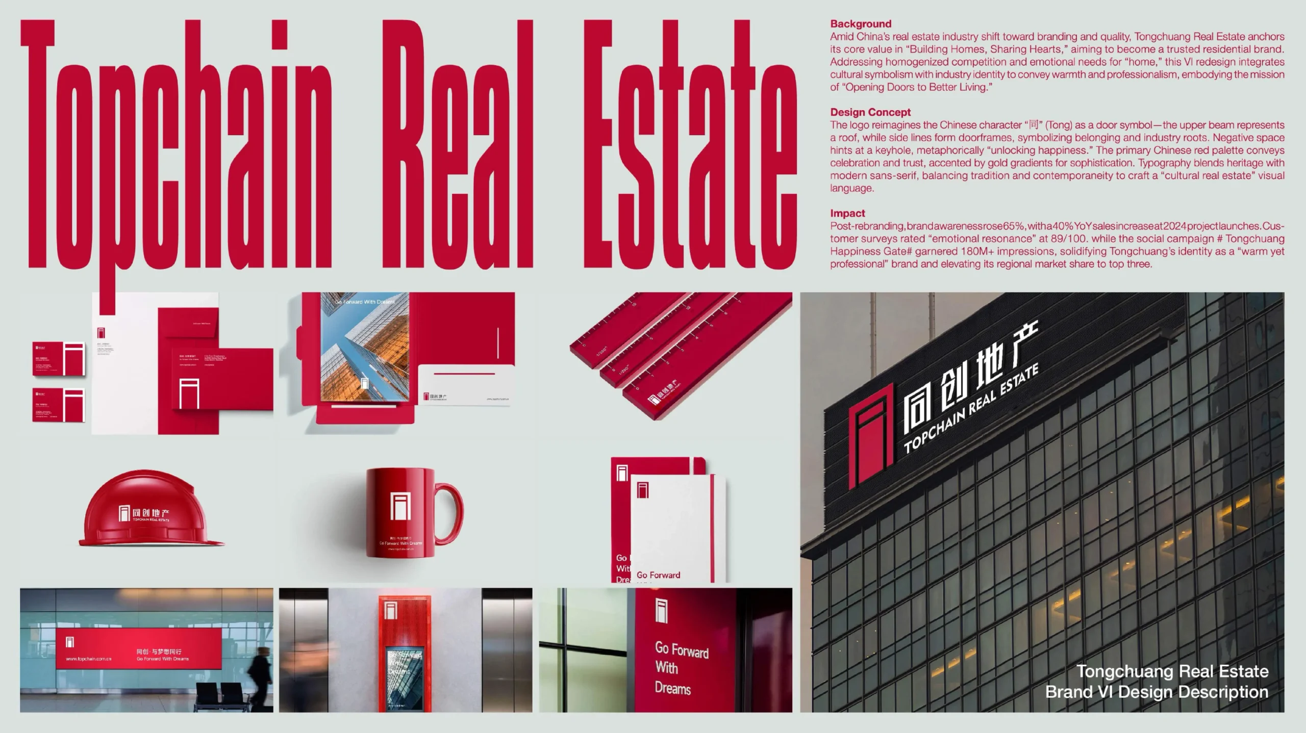
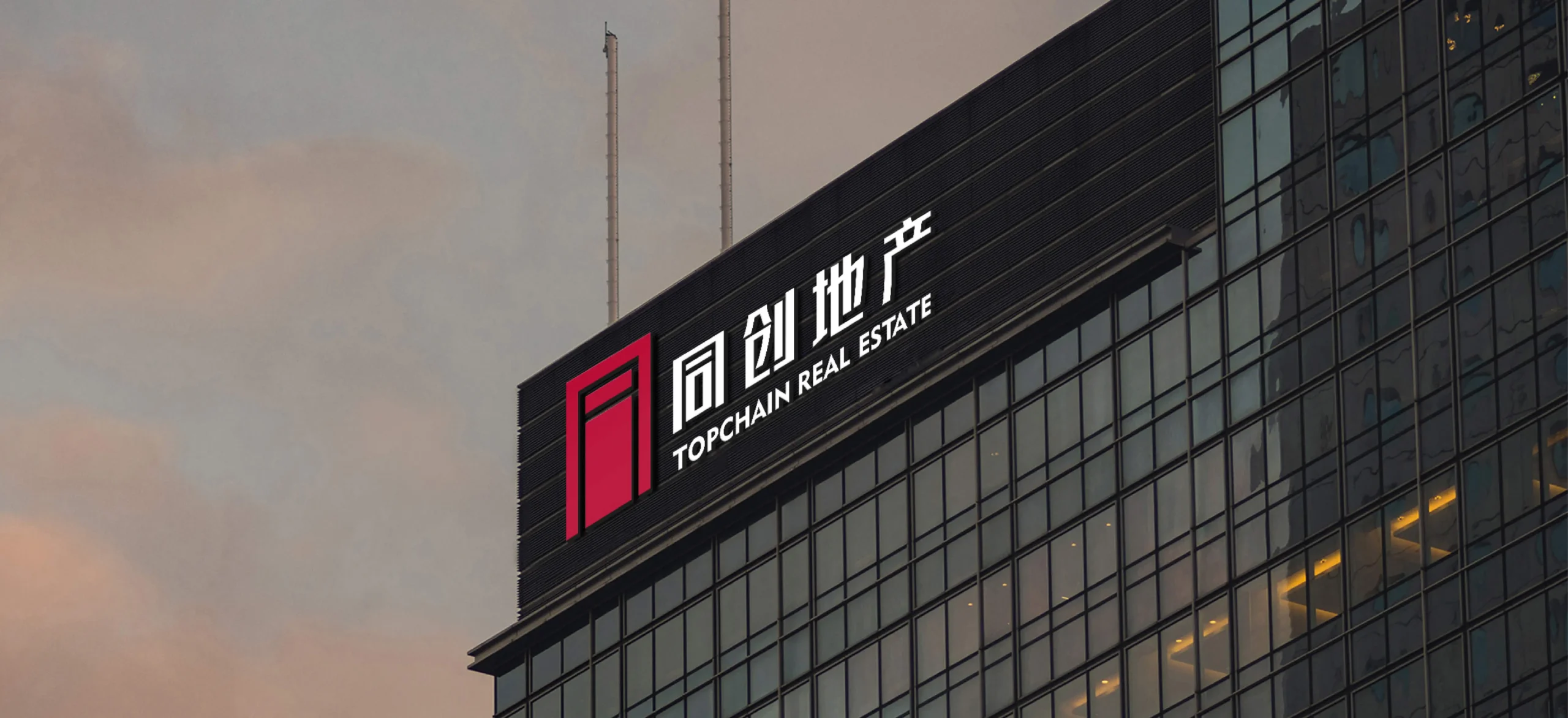
在中国地产行业加速品牌化与品质升级的背景下,同创地产以“筑家·同心”为核心价值,致力于打造值得信赖的人居品牌。面对消费者对“家”的情感诉求与行业同质化竞争,此次VI升级聚焦文化符号与行业属性的深度融合,通过视觉体系传递品牌温度与专业承诺,强化“开启美好生活之门”的品牌使命。标志以汉字“同”为核心,解构为门形符号——顶部横梁象征屋檐,两侧竖线延伸为门框,寓意“家”的归属与行业根基;内部负空间融入钥匙孔形态,隐喻“开启幸福”。主色调采用中国红,传递喜庆、信赖与活力,辅以浅金色渐变增强质感;字体设计融合宋体结构与现代无衬线风格,平衡传统人文与当代审美,构建“文化地产”的视觉语言。
Against the backdrop of the accelerated branding and quality upgrade in China’s real estate industry, Tongchuang Real Estate, with the core value of “Building Homes Together”, is committed to creating a trustworthy residential brand. In response to consumers’ emotional demands for “home” and the homogenized competition in the industry, this VI upgrade focuses on the deep integration of cultural symbols and industry attributes, conveying brand warmth and professional commitment through the visual system, and strengthening the brand mission of “opening the door to a better life”.The logo takes the Chinese character “同” as its core and deconstructs it into a door-shaped symbol – the top beam symbolizes the eaves, and the vertical lines on both sides extend into the door frame, symbolizing the sense of belonging to “home” and the foundation of the industry. The internal negative space integrates a keyhole shape, symbolizing “unlocking happiness”. The main color tone adopts Chinese red, conveying joy, trust and vitality, supplemented by a light gold gradient to enhance the texture. The font design integrates the structure of Song typeface with the modern sans-serif style, balancing traditional humanism with contemporary aesthetics, and constructs the visual language of “cultural real estate”.
