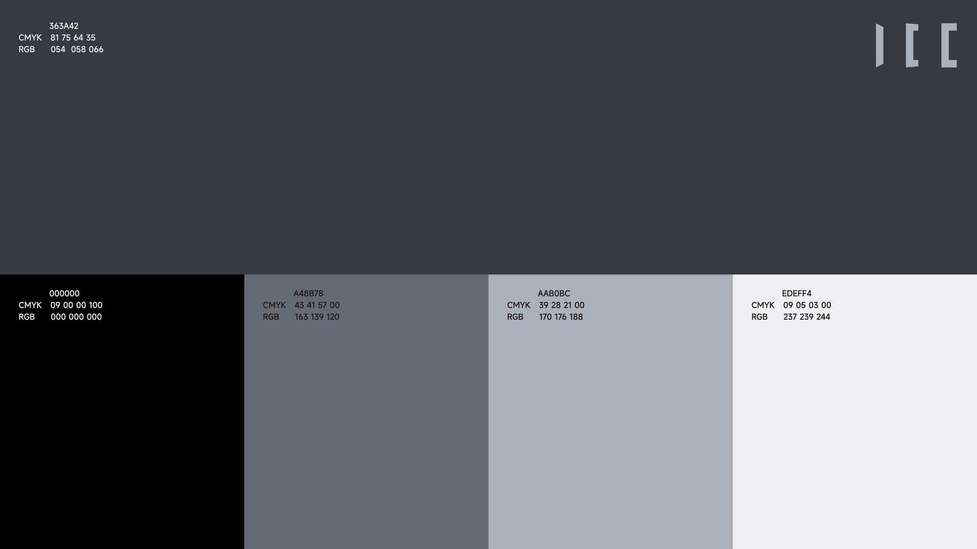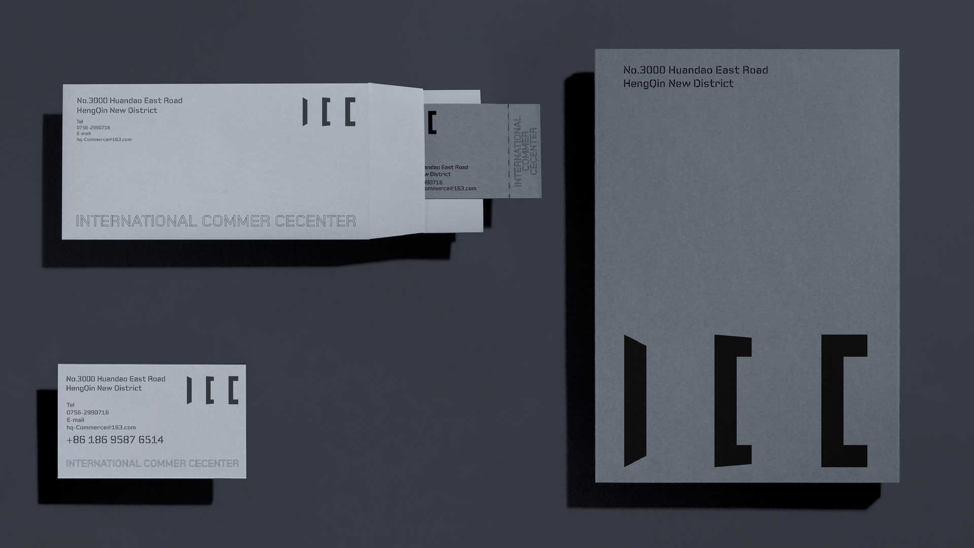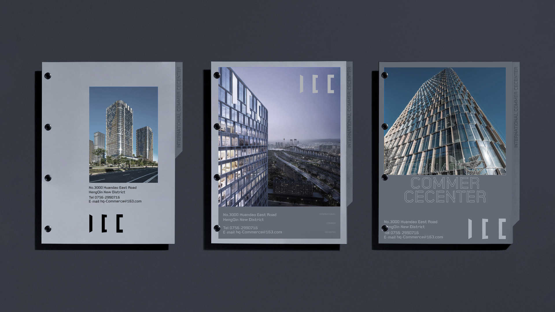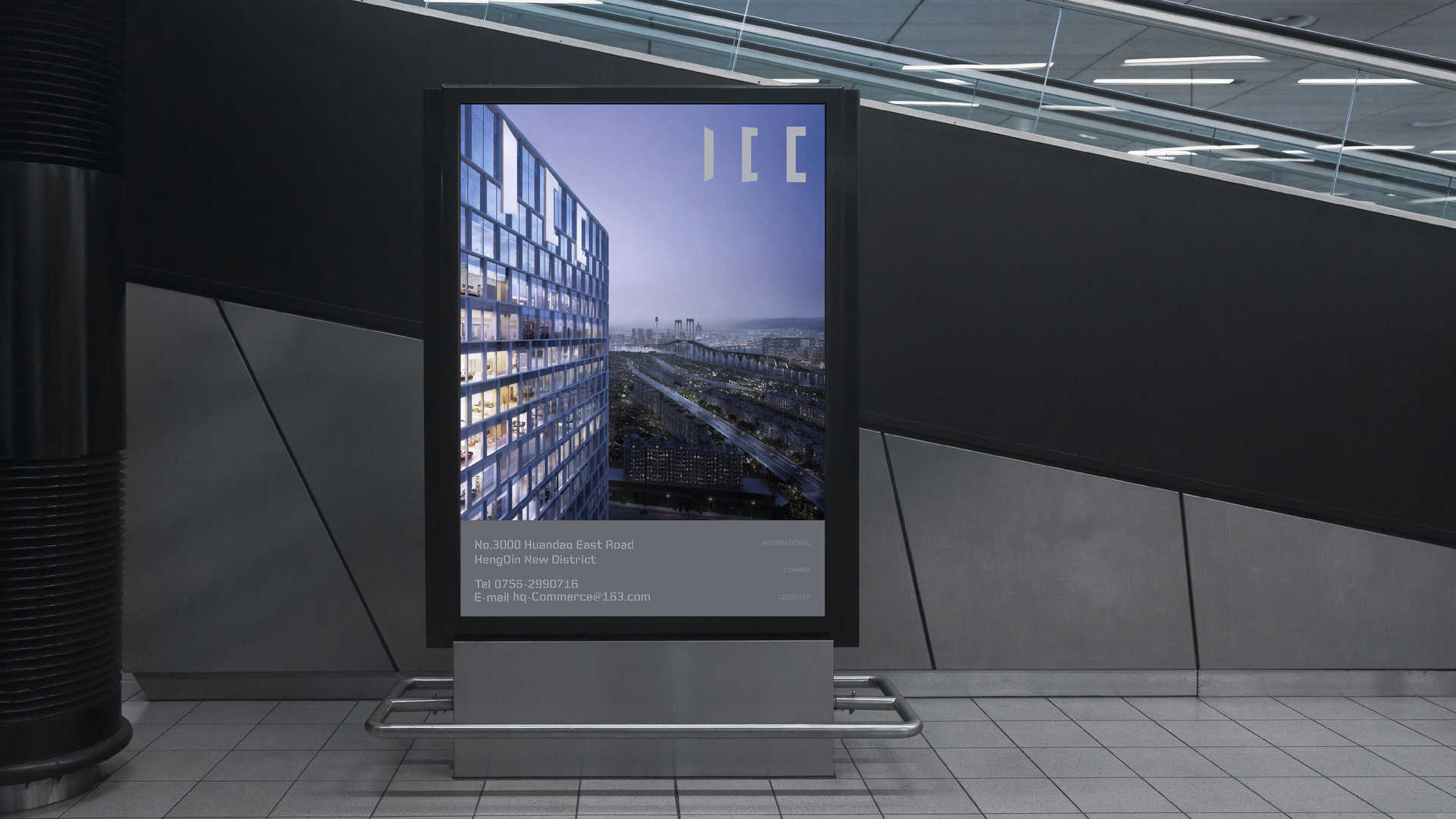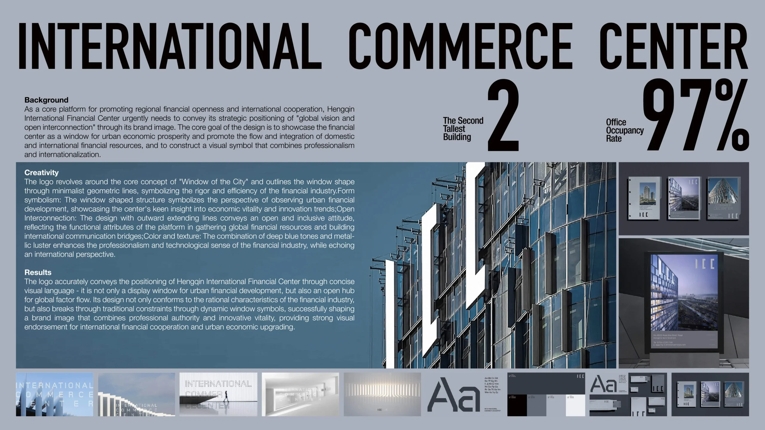

横琴国际商务中心作为推动区域金融开放与国际化合作的核心平台 需通过品牌形象传递其“至球视野开放互联”的战略定位。设计以展现金融中心作为城市经济繁荣的窗口、促进国内外金融资源流动与融合的使命为核心目标,构建兼具专业性与国际化的视觉符号。标志以“城市之窗”为核心概念,通过极简的几何线条勾勒出窗形轮廓,窗形结构象征观察城市金融发展的视角 展现中心对经济活力与创新趋势的敏锐洞察;线条向外延展的设计传递开放与包容的态度体现平台汇聚全球金融资源、搭建国际交流桥梁的功能属性,采用深蓝色调与金属光泽结合,强化金融行业的专业性与科技感,同时呼应国际化视野。
As a core platform for promoting regional financial opening-up and international cooperation, Hengqin International Business Center needs to convey its strategic positioning of “global vision, open Interconnection” through its brand image. The design takes showcasing the mission of the financial center as a window to the city’s economic prosperity and promoting the flow and integration of domestic and international financial resources as its core goal, and constructs a visual symbol that is both professional and international.The logo takes “the window of the city” as its core concept, outlining the window-shaped outline through minimalist geometric lines. The window-shaped structure symbolizes the perspective of observing the city’s financial development, demonstrating the center’s acute insight into economic vitality and innovation trends. The design with lines extending outward conveys an open and inclusive attitude, reflecting the platform’s functional attributes of gathering global financial resources and building an international exchange bridge. The combination of deep blue tones and metallic luster enhances the professionalism and technological feel of the financial industry, while also echoing an international perspective.