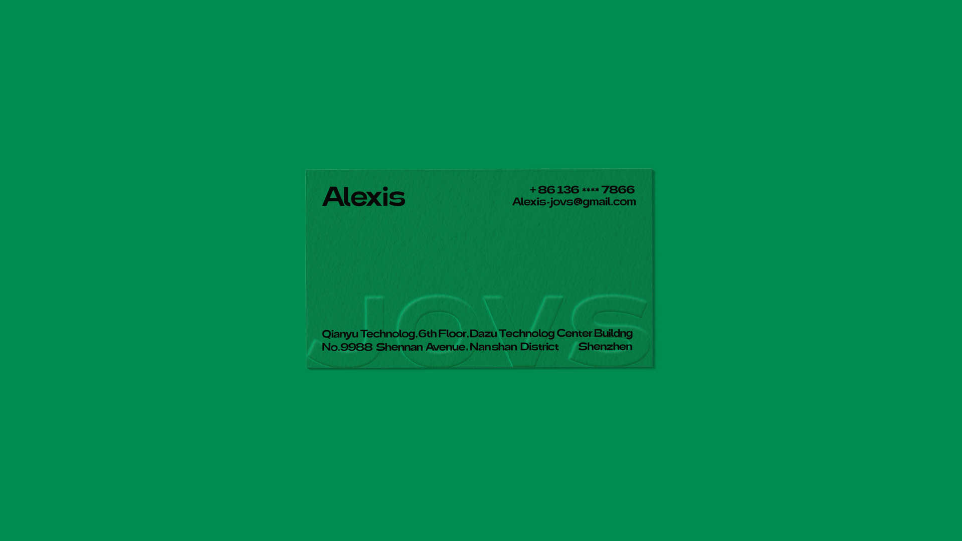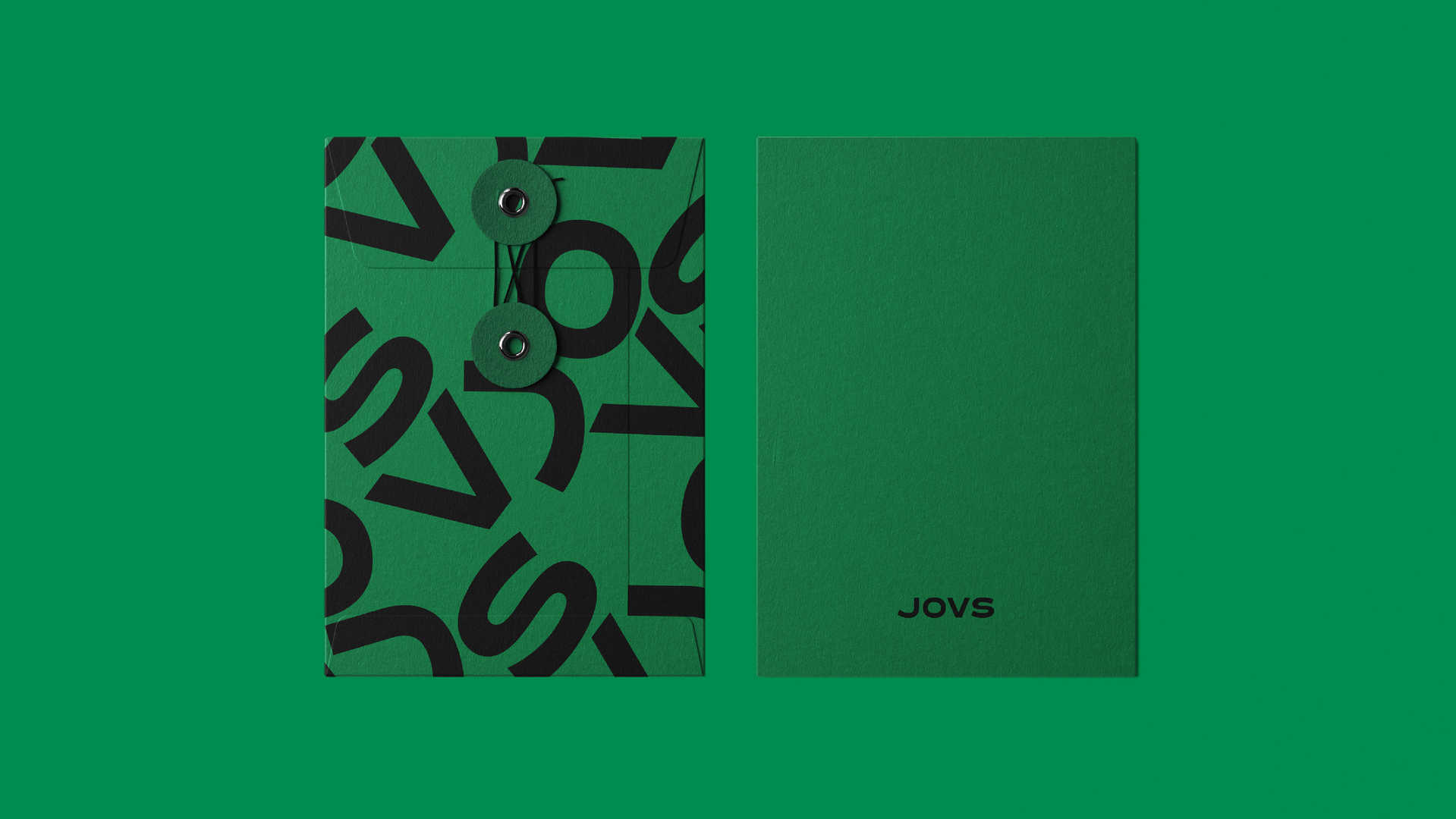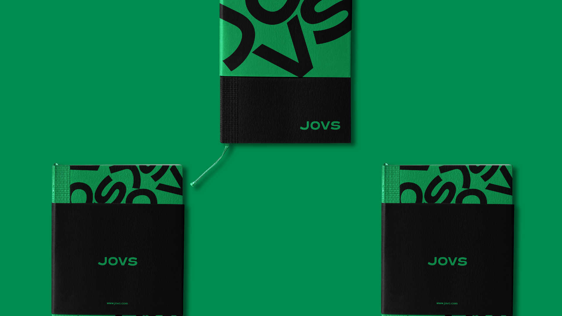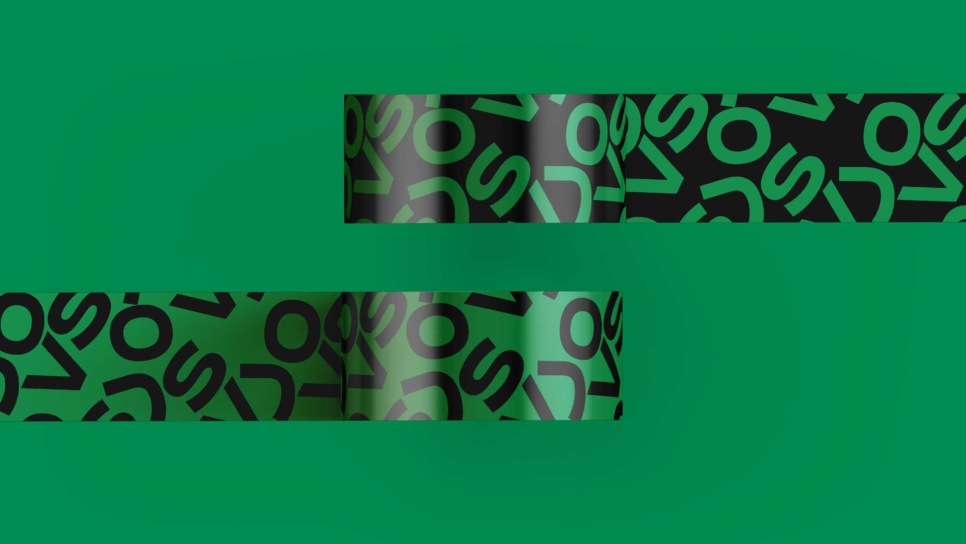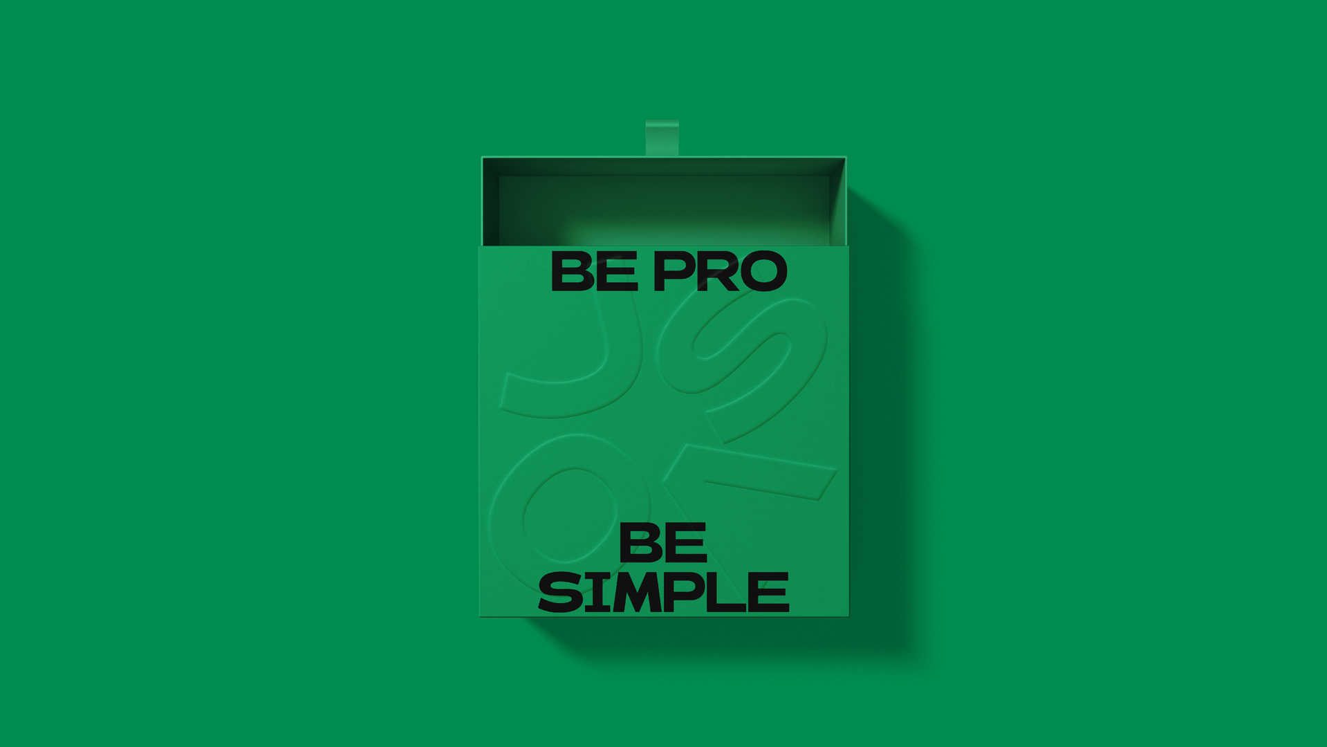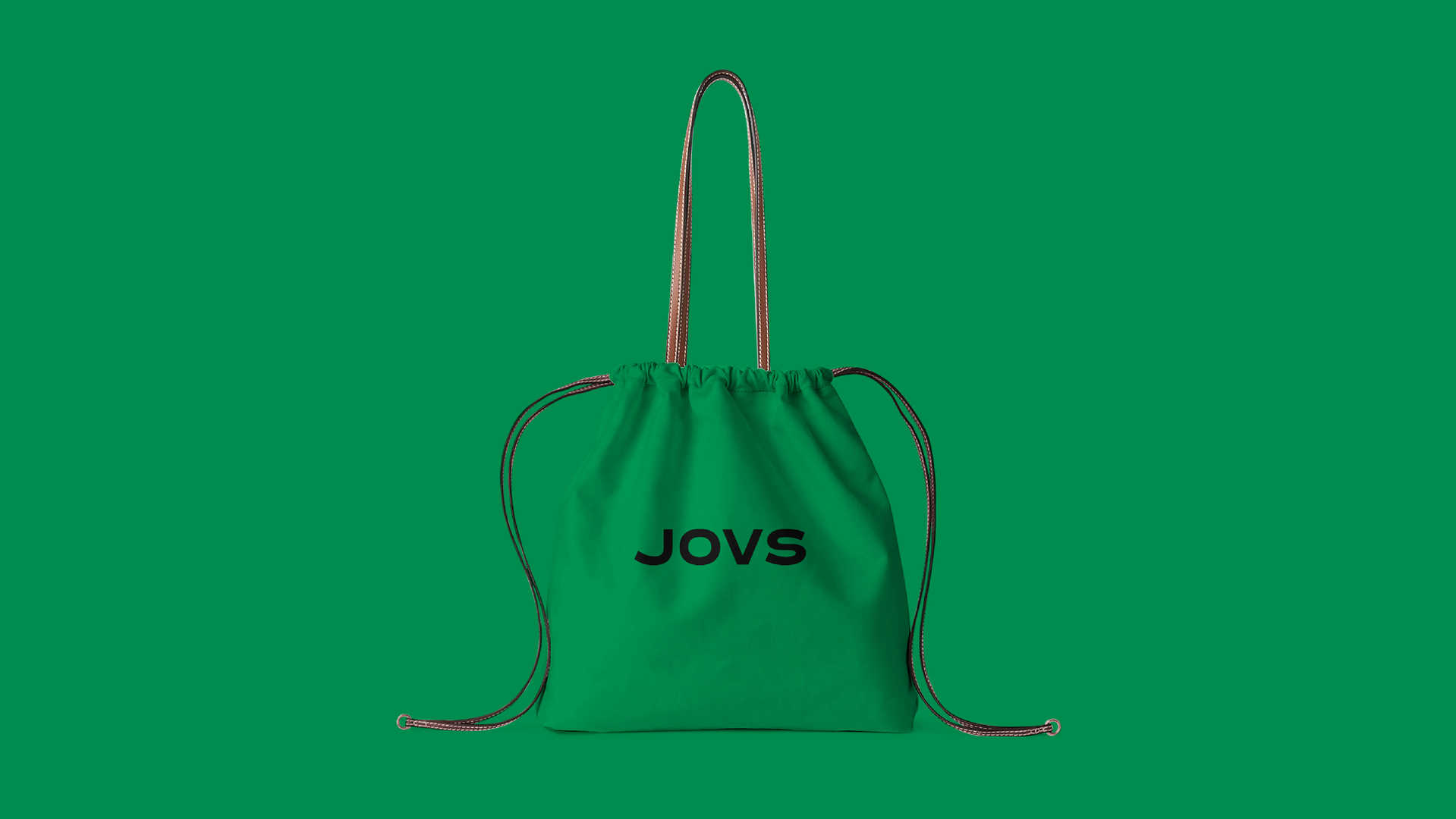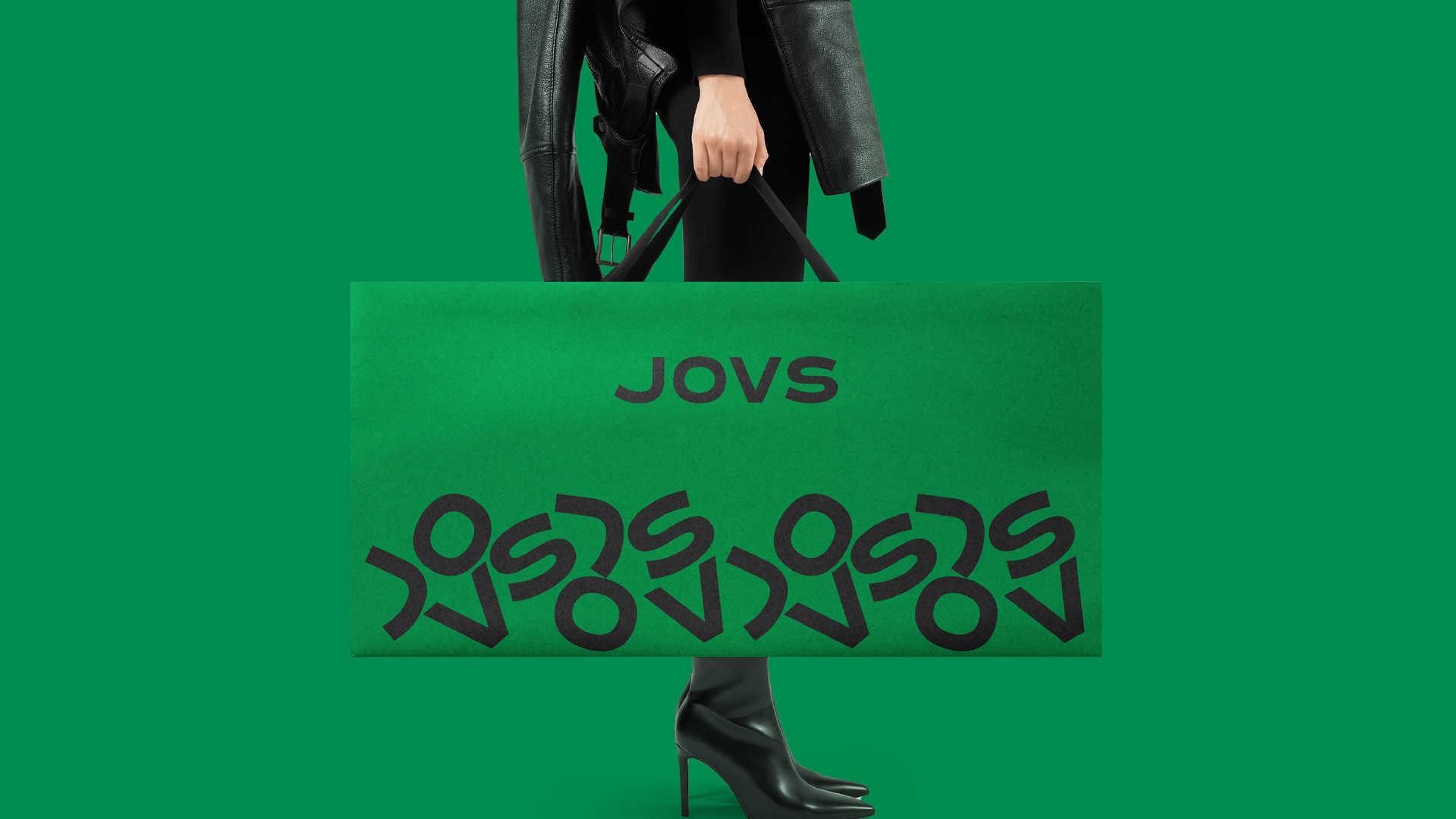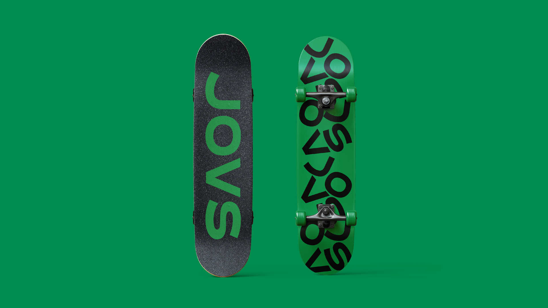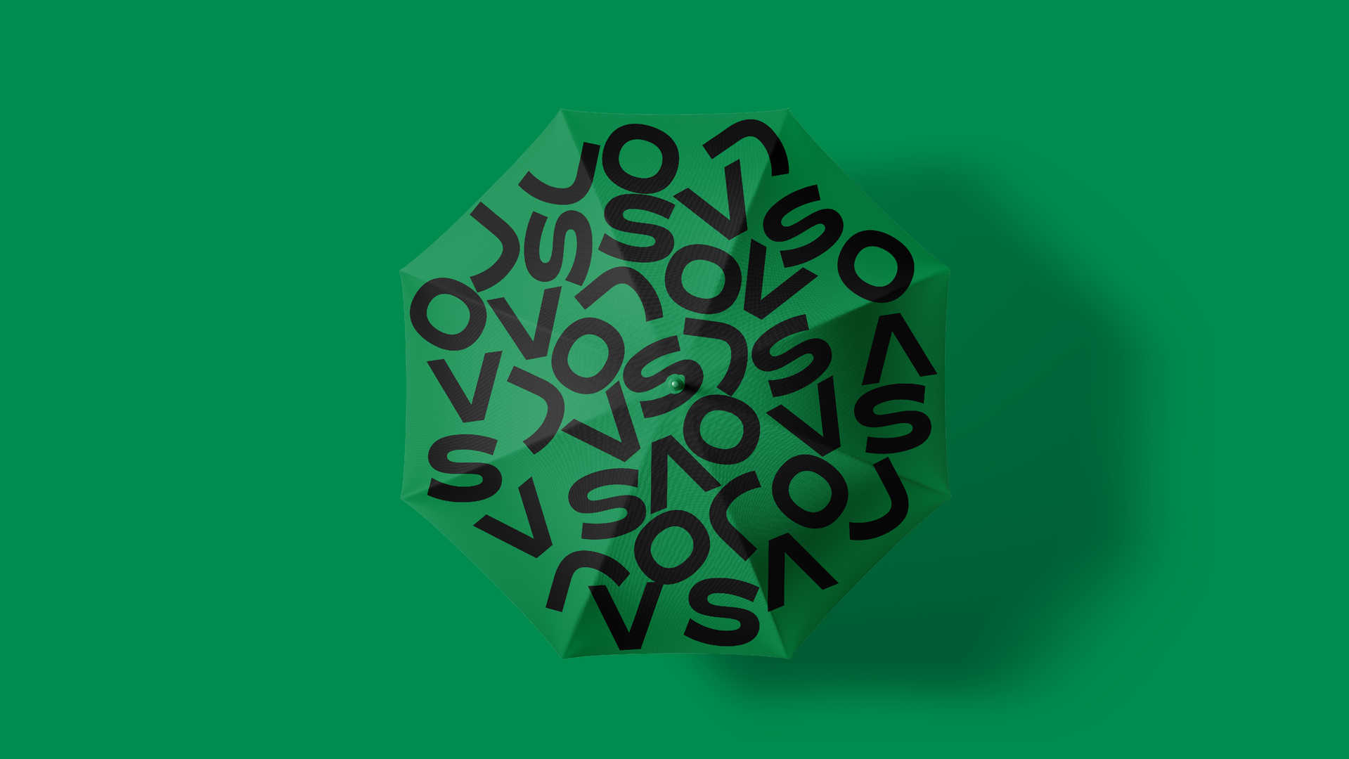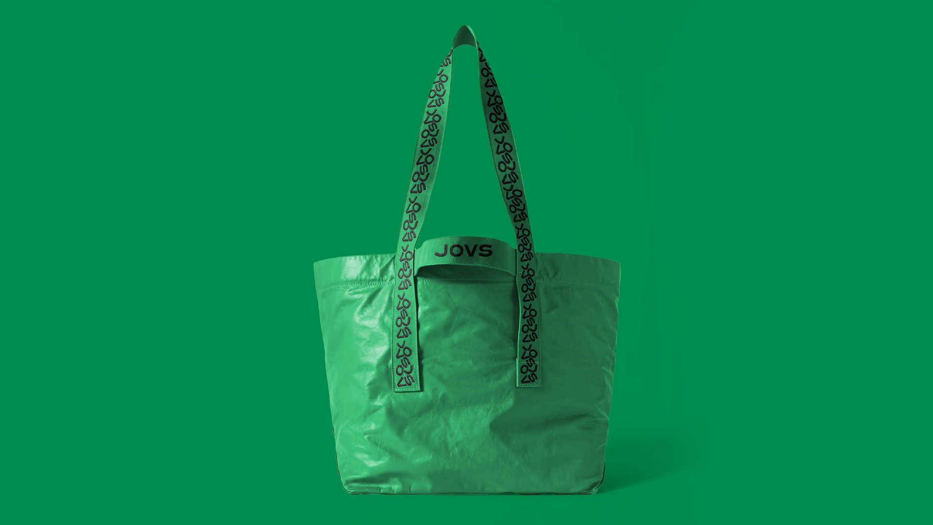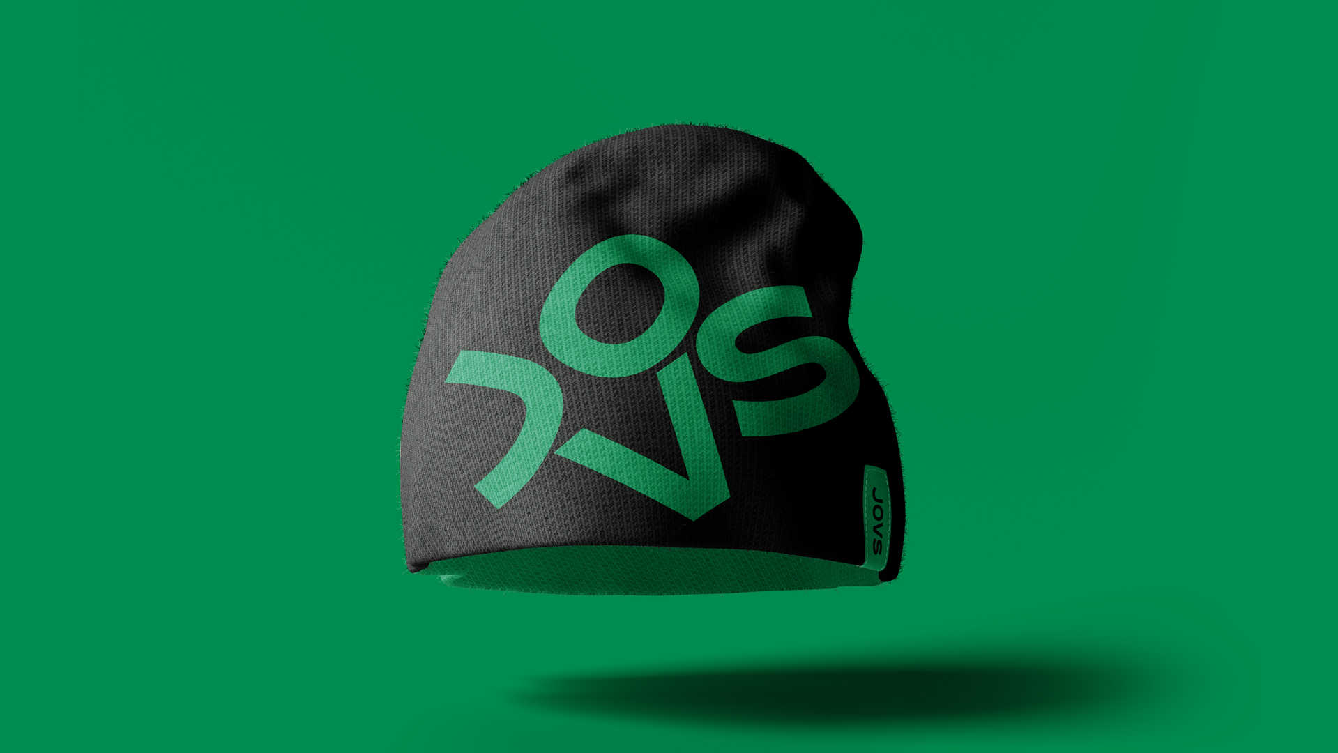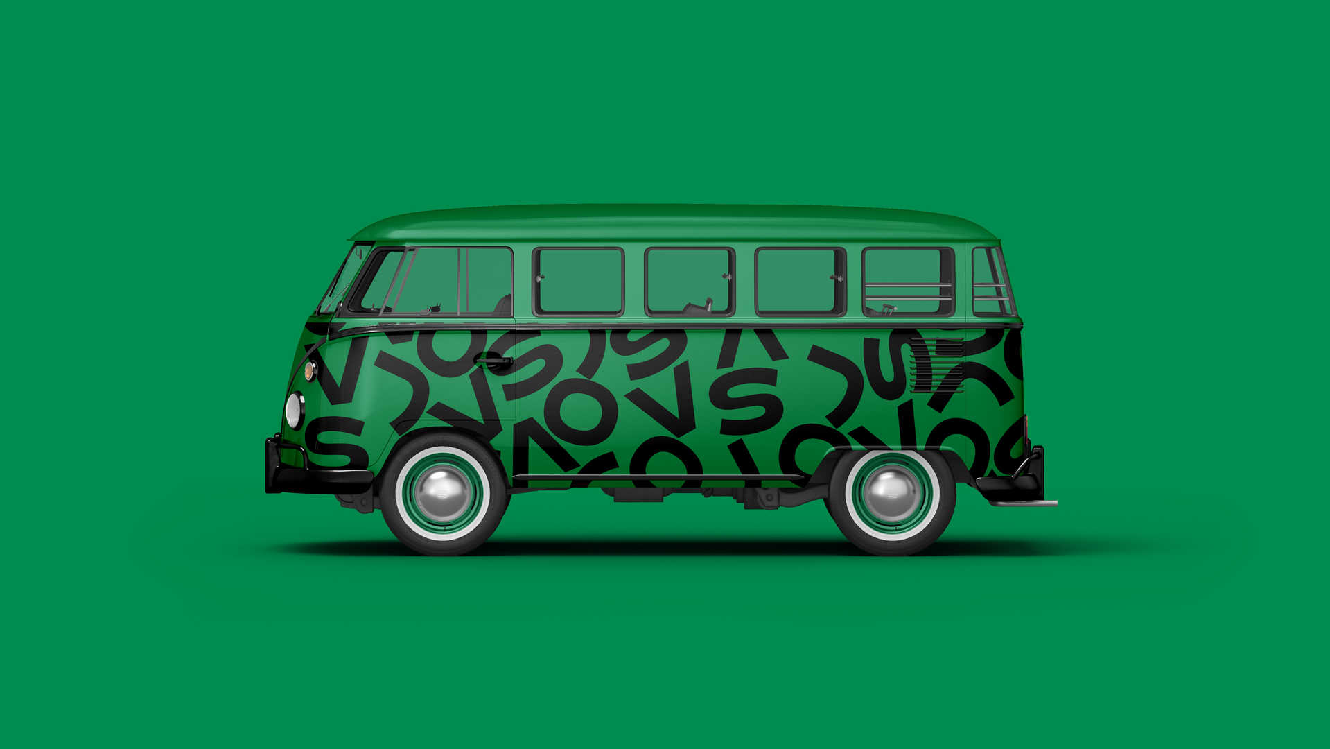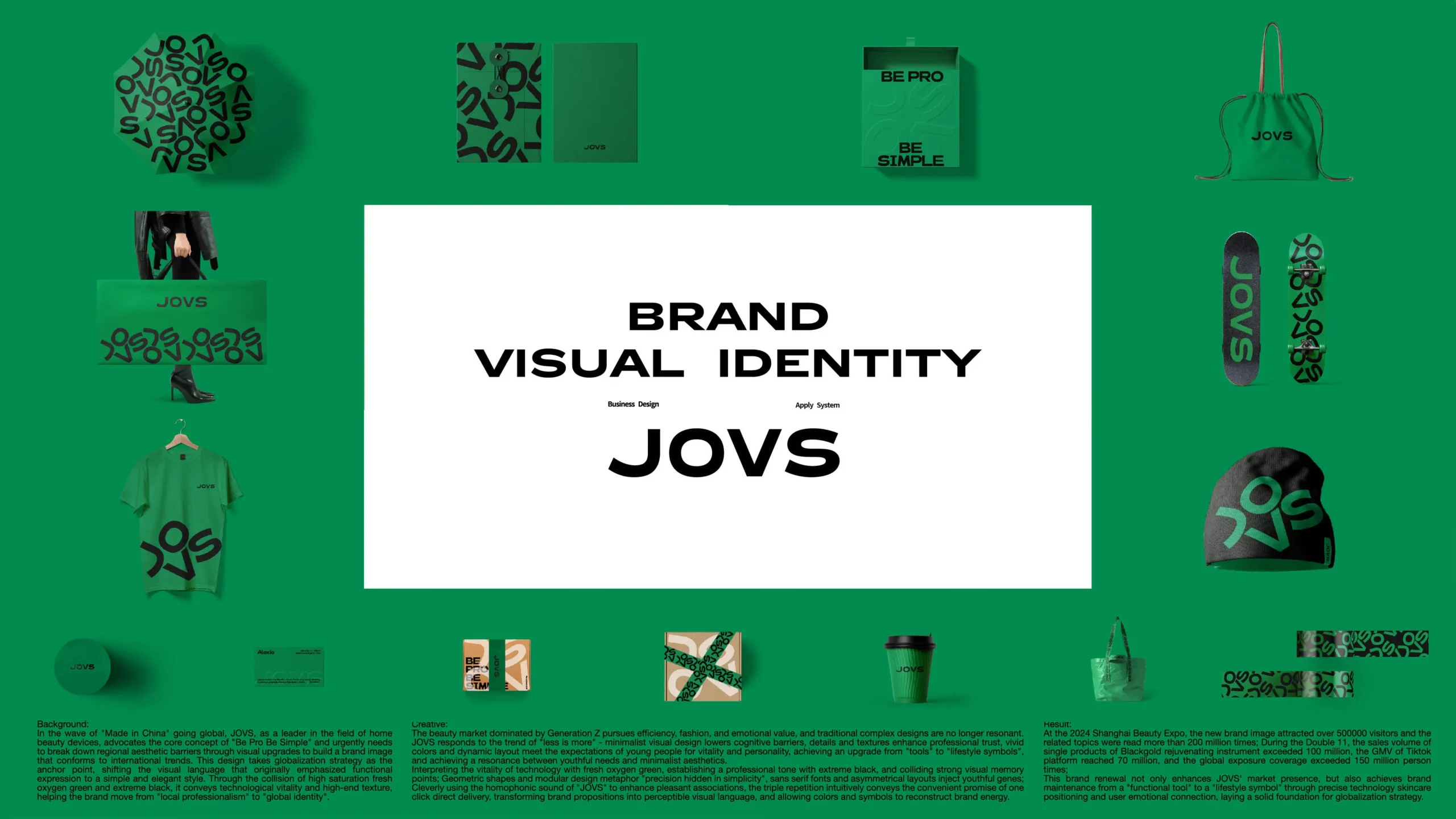
在“中国智造”出海浪潮中,JOVS作为家用美容仪领域的领军者,以“专业即简单”为核心主张,亟需通过视觉升级打破地域审美壁垒,构建符合国际趋势的品牌形象。此次设计以全球化战略为锚点,将原本偏重功能表达的视觉语言转向简洁优雅的风格,通过高饱和的鲜氧绿与极致黑碰撞,传递科技活力与高端质感,助力品牌从“本土专业”迈向“全球认同”。JOVS品牌焕新以“少即是多”回应趋势——极简视觉降低认知门槛,细节质感强化专业信任,鲜活的色彩与动态排版则契合年轻群体对活力与个性的期待,实现从“工具”到“生活方式符号”的升维,达到年轻化需求与极简美学的共振。以鲜氧绿诠释科技生命力,极致黑奠定专业基调,碰撞出强烈的视觉记忆点;几何图形与模块化设计隐喻“精密藏于简形”,无衬线字体与不对称布局注入年轻基因;巧用“JOVS”谐音强化愉悦联想,三重重复直观传递一键直达的便捷承诺,将品牌主张转化为可感知的视觉语言,让色彩与符号重构品牌能量。
In the wave of “Made in China” going global, JOVS, as a leader in the home beauty device field, takes “professionalism is simplicity” as its core proposition and urgently needs to break through regional aesthetic barriers through visual upgrades to build a brand image that conforms to international trends. This design takes the global strategy as the anchor point, shifting the visual language that originally focused on functional expression to a simple and elegant style. Through the collision of highly saturated fresh oxygen green and ultimate black, it conveys technological vitality and high-end texture, helping the brand move from “local professionalism” to “global recognition”.The brand renewal of JOVS responds to the trend with the slogan “Less is More” – minimalist visuals lower the cognitive threshold, detailed texture enhances professional trust, and vivid colors and dynamic layout meet the expectations of the younger generation for vitality and individuality, achieving an upgrade from a “tool” to a “symbol of lifestyle”, and resonating with the demands of the younger generation and minimalist aesthetics.The fresh oxygen green interprets the vitality of technology, and the ultimate black sets the professional tone, creating a strong visual memory point. Geometric shapes and modular design metaphorically represent “precision hidden in simplicity”, while sans-serif fonts and asymmetrical layouts infuse youthful genes. Skillfully using the homophonic “JOVS” to enhance pleasant associations, the triple repetition intuitively conveys the convenient promise of one-click access, transforming the brand proposition into a perceptible visual language, and allowing colors and symbols to reconstruct the brand’s energy.