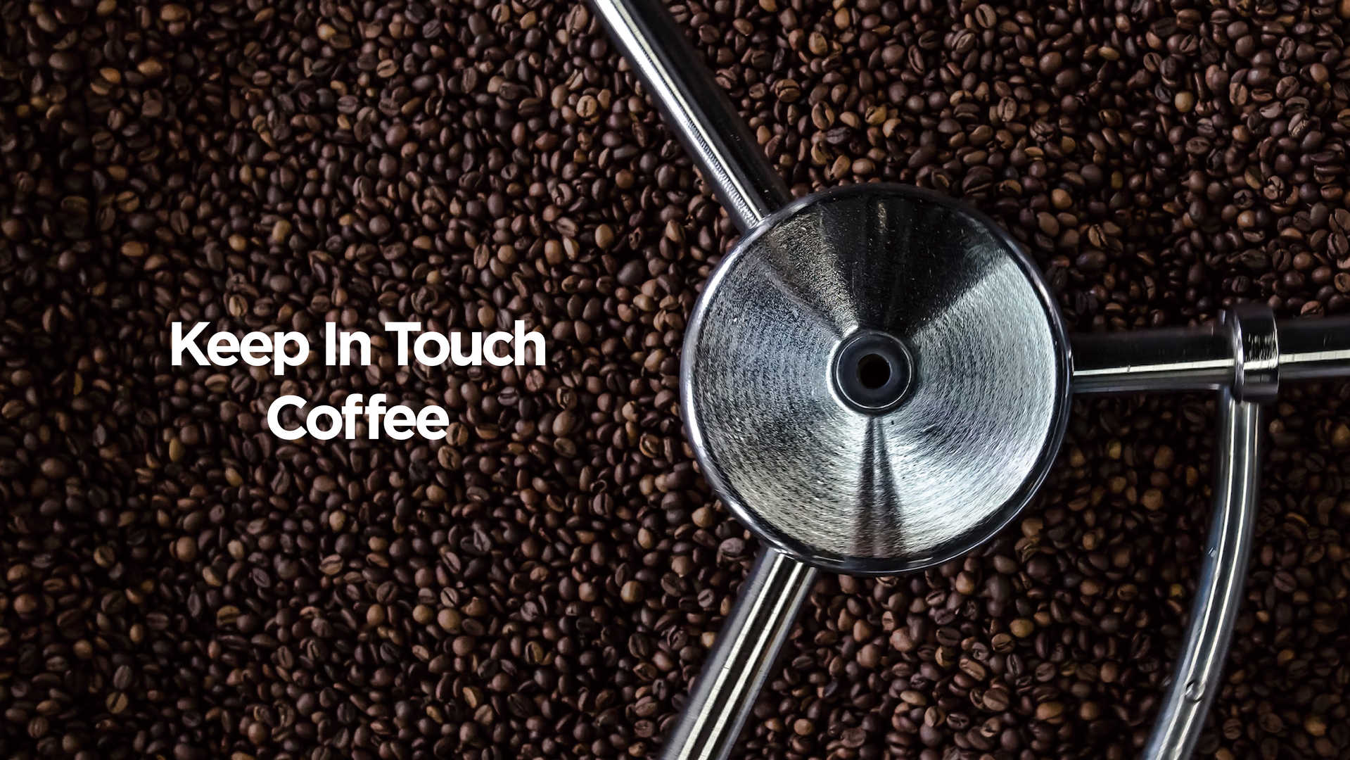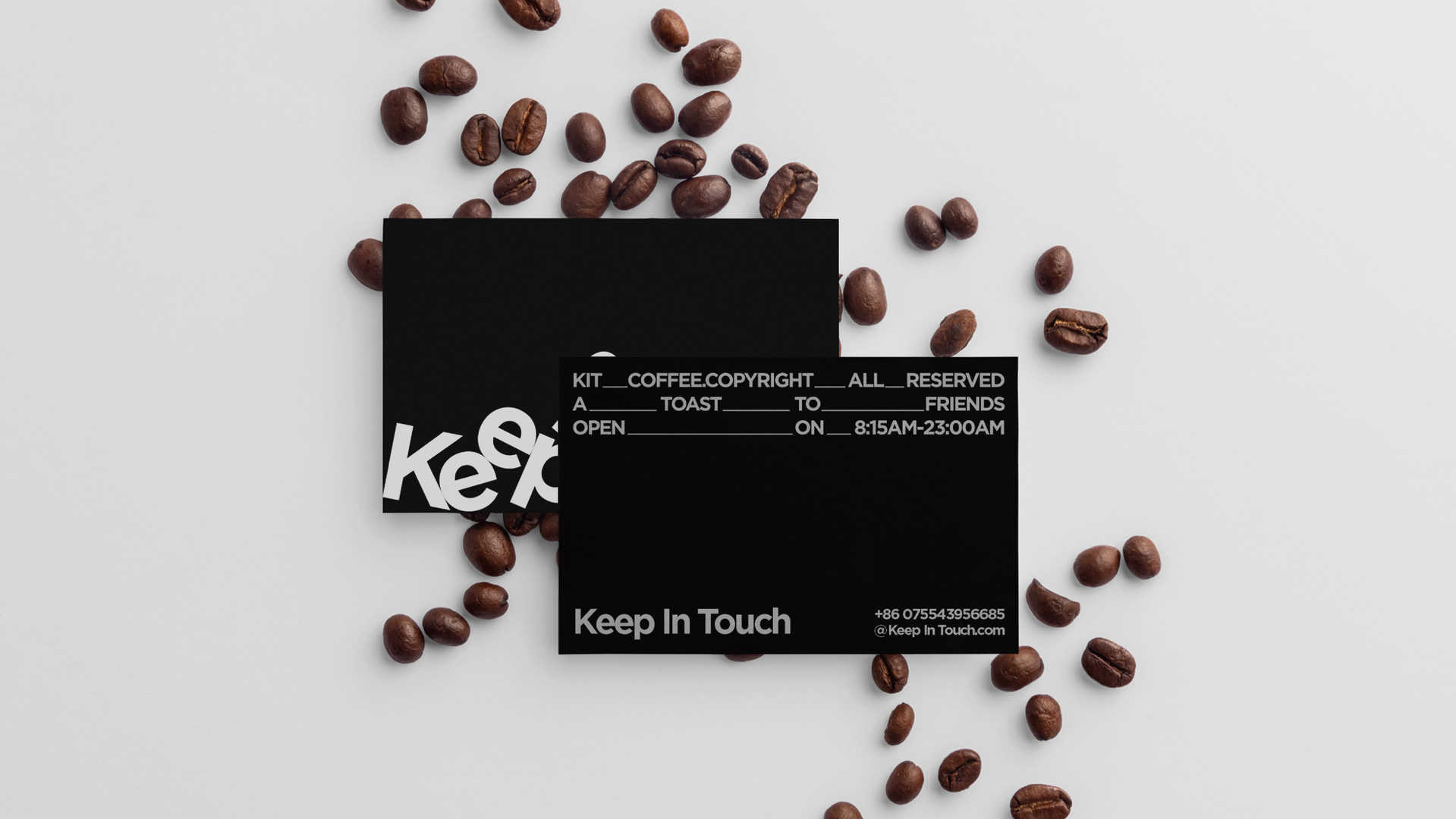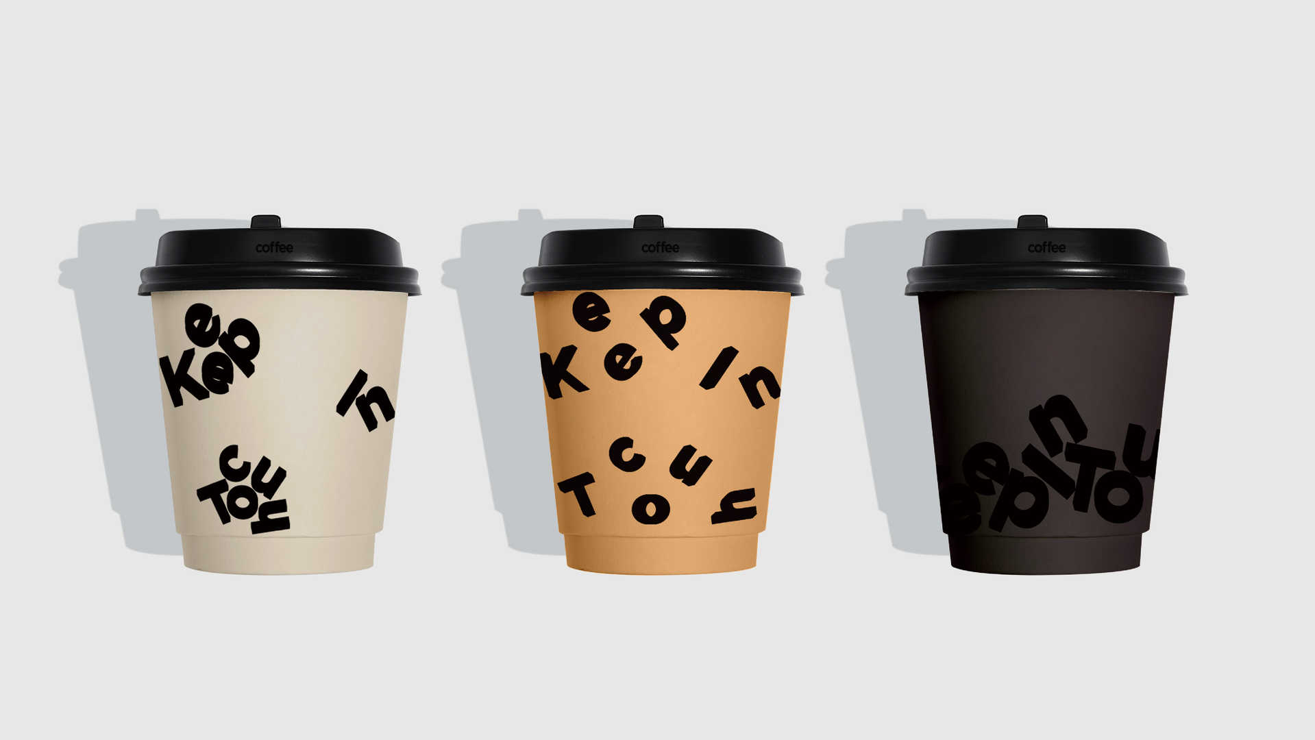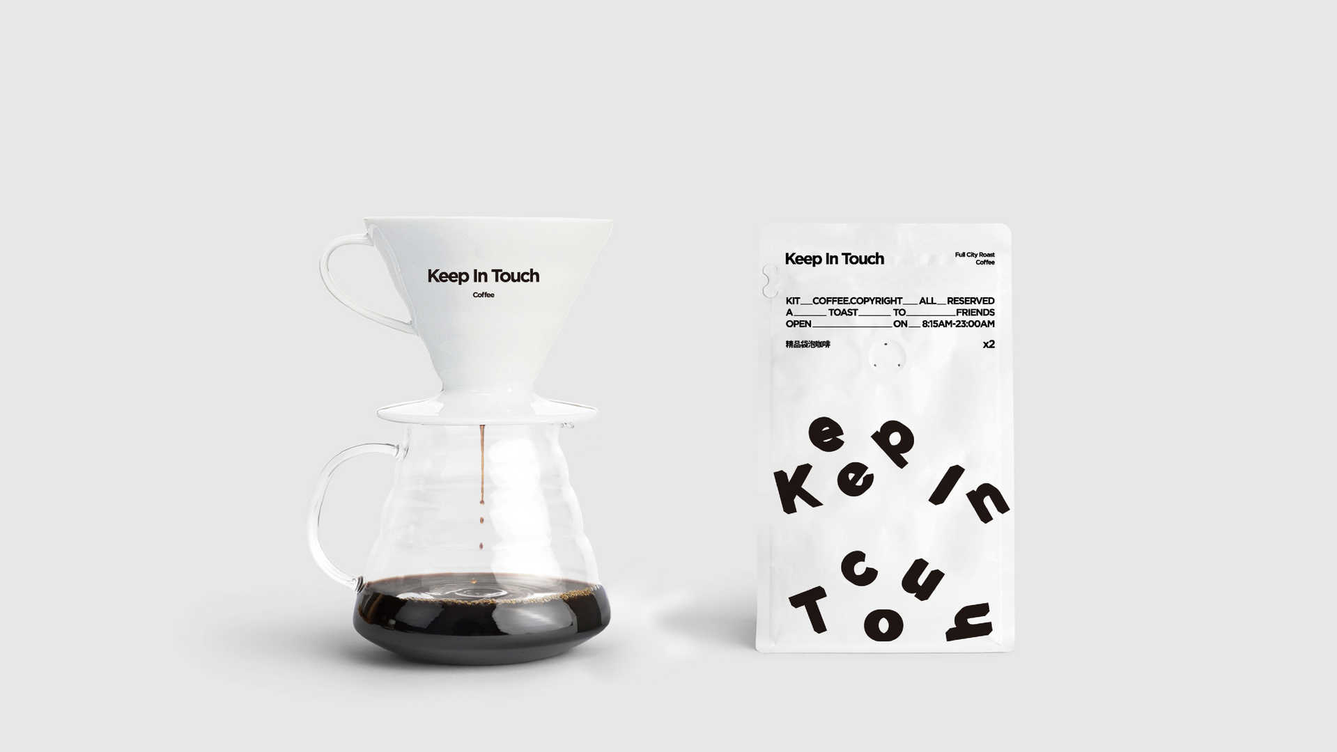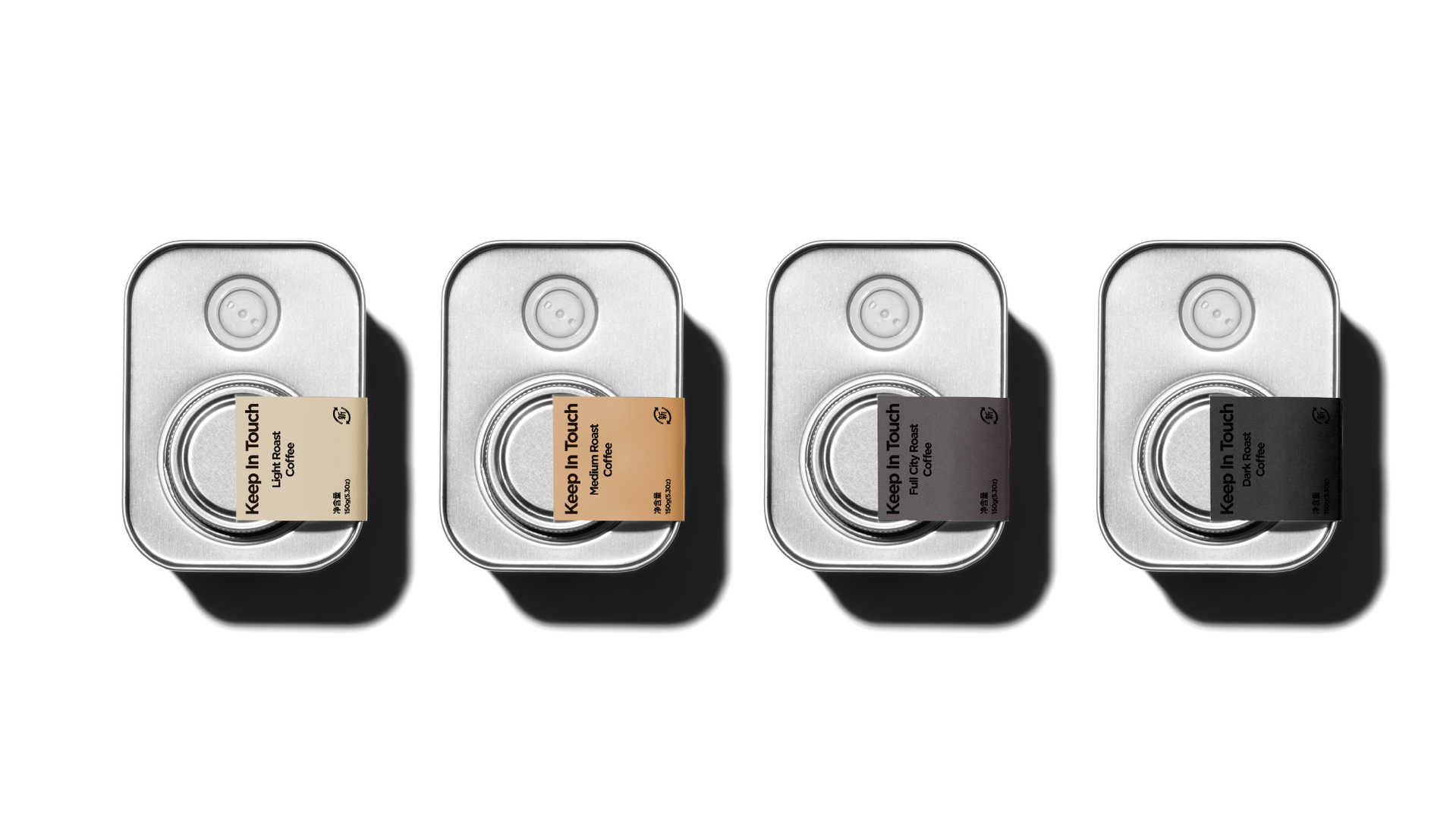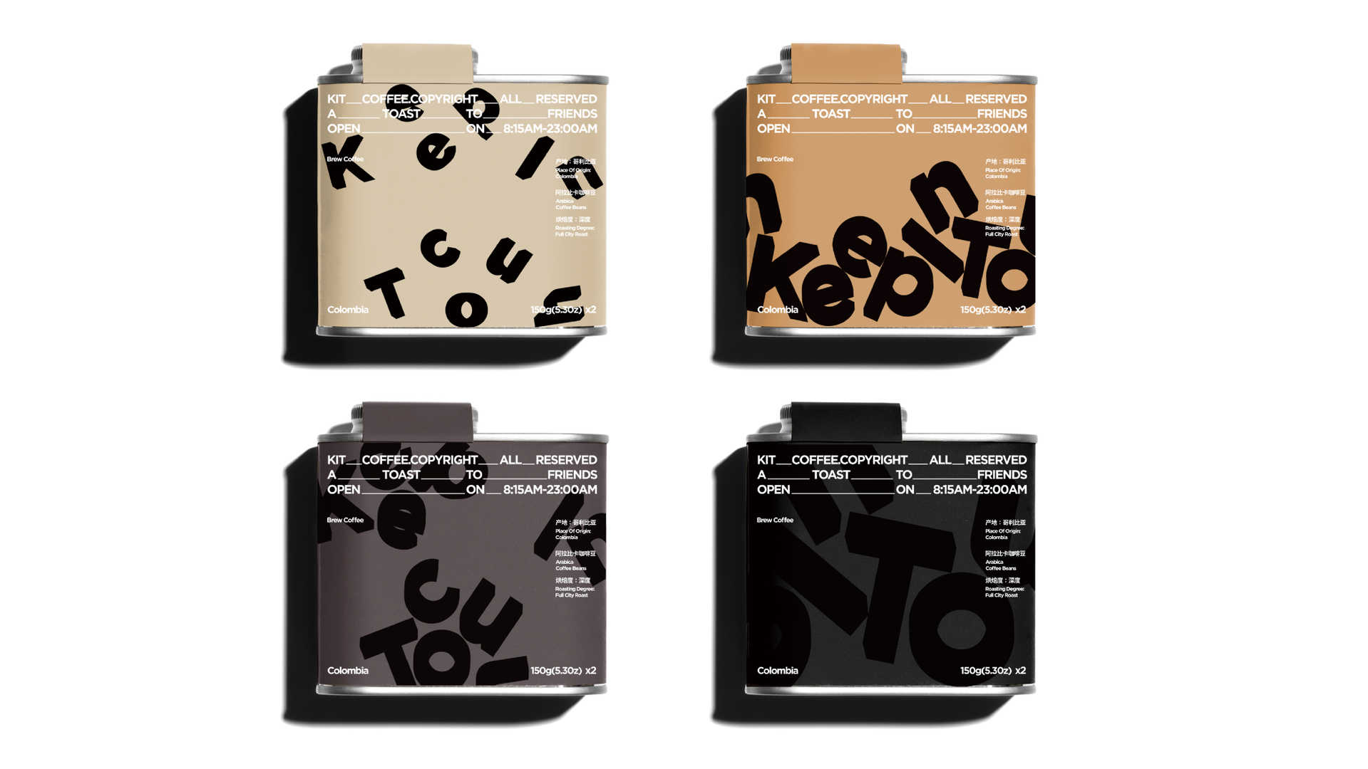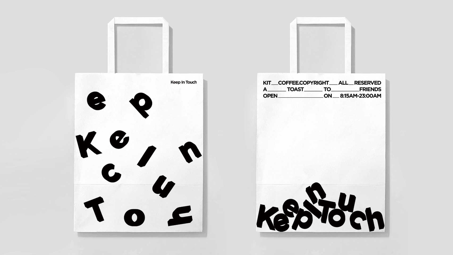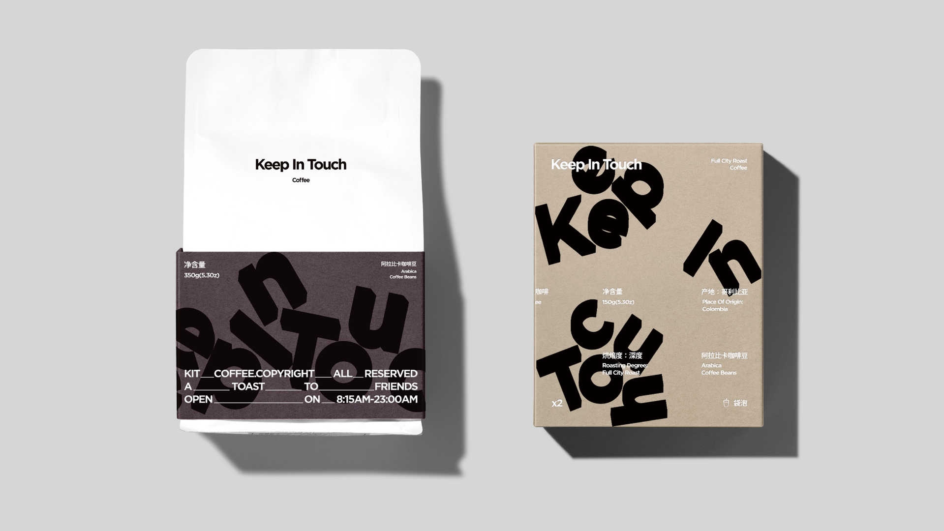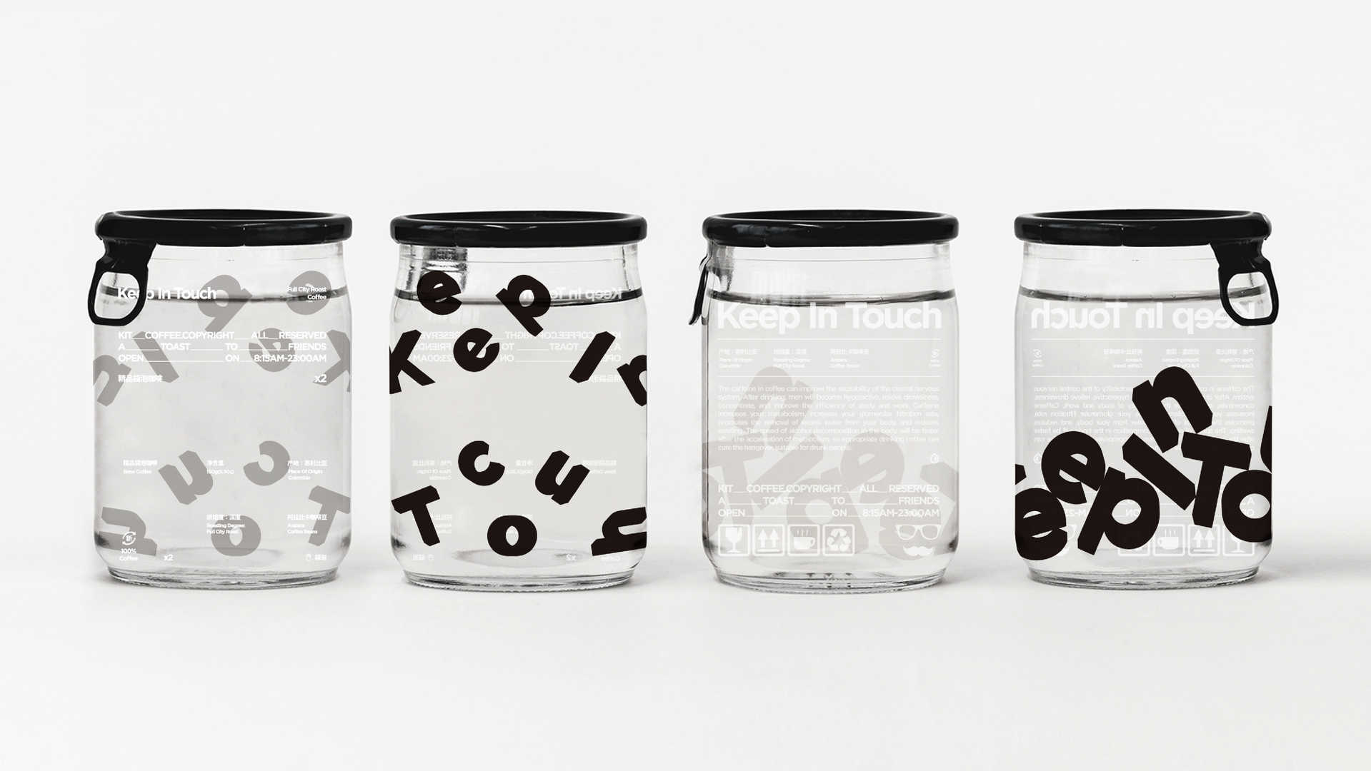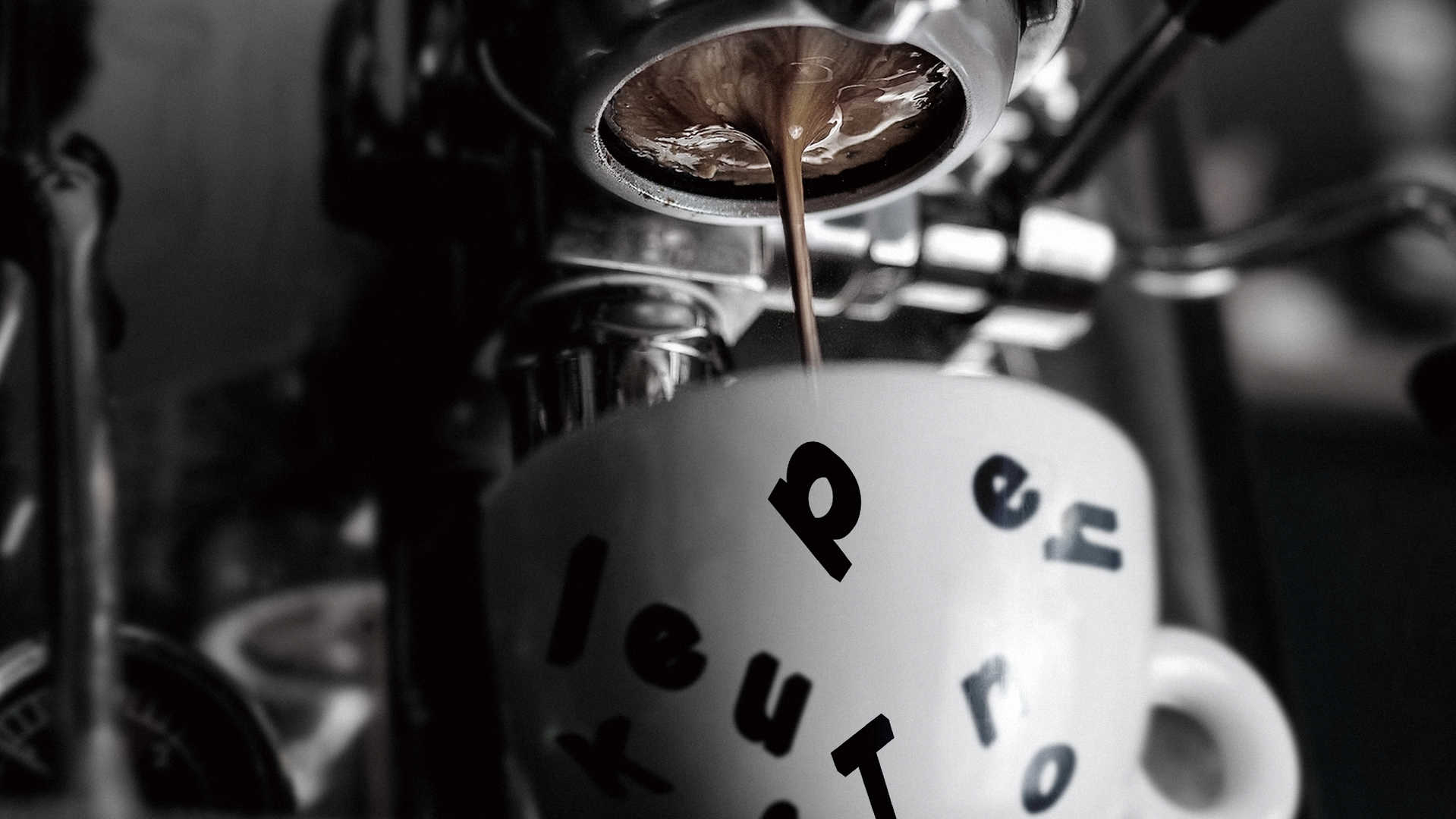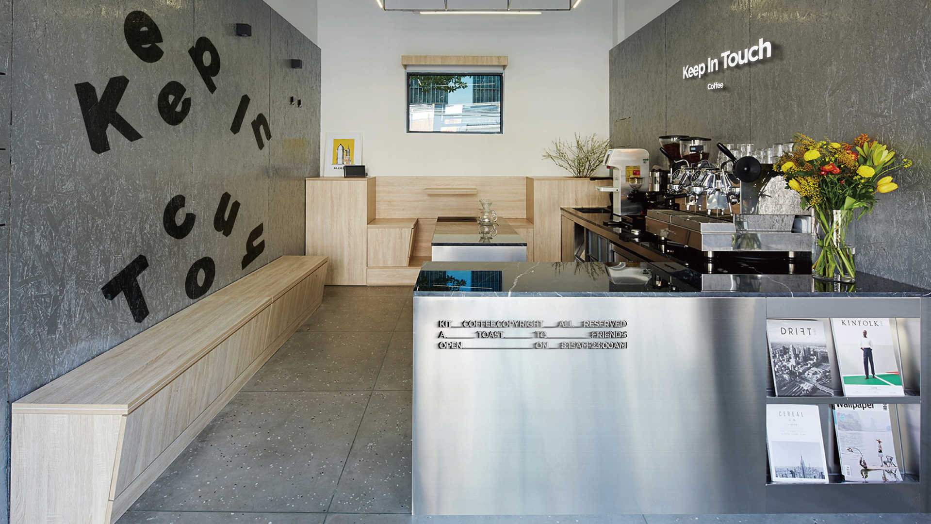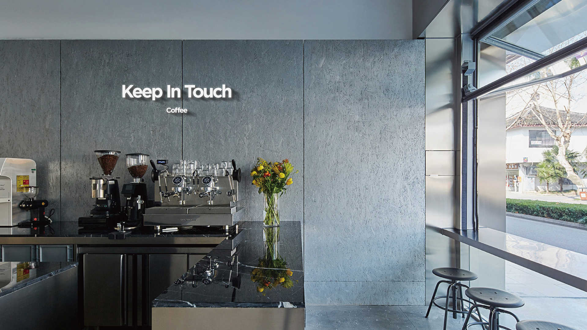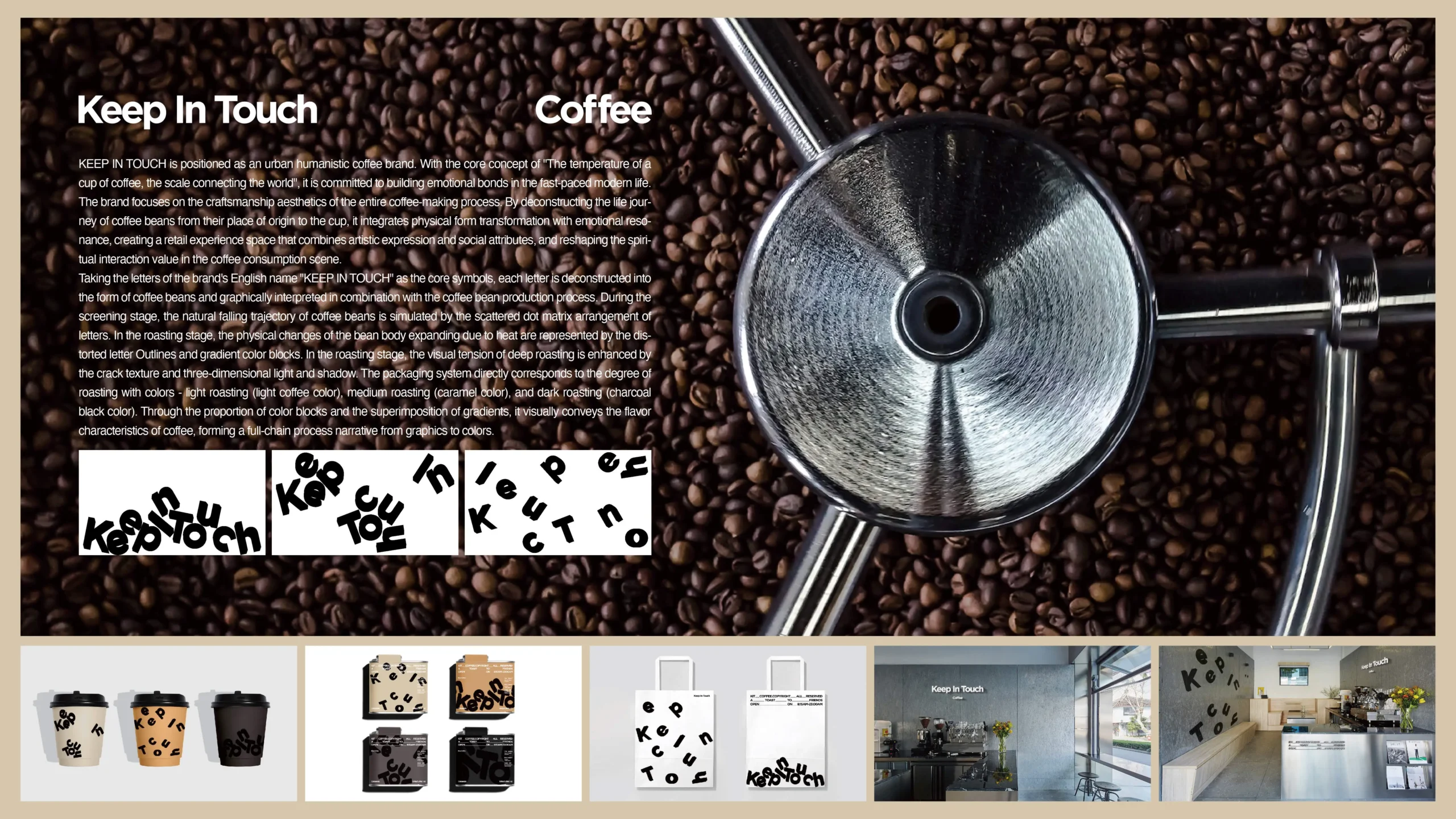
KEEP IN TOUCH(保持联系)定位为都市人文咖啡品牌,以“一杯咖啡的温度,连接世界的刻度”为核心理念,致力于在快节奏的现代生活中构建情感纽带。品牌聚焦咖啡制作全流程的匠心美学,通过解构咖啡豆从原产地到杯中的生命旅程,将物理形态转化与情感共鸣相融合,打造兼具艺术表达与社交属性的零售体验空间,重塑咖啡消费场景中的精神交互价值。以品牌英文名“KEEP IN TOUCH”字母为核心符号,将每个字母解构为咖啡豆形态,结合咖啡豆制作流程进行图形化演绎:筛选阶段以字母散落的点阵排列模拟咖啡豆自然掉落轨迹;炒制阶段通过扭曲变形的字母轮廓与渐变色块表现豆体受热膨胀的物理变化;烘焙阶段运用裂纹质感与立体光影强化深度烘焙的视觉张力。包装体系以色彩直接对应烘焙程度——浅烘(浅咖色)、中烘(焦糖色)、深烘(炭黑色),通过色块比例与渐变叠加直观传递咖啡风味特征,形成从图形到色彩的全链路工艺叙事。品牌上线后社交媒体话题曝光量超1200万次,首月门店客流量同比增长65%,定制咖啡豆礼盒复购率达42%。用户调研显示“字母咖啡豆”符号认知度达91%,包装色彩体系准确传递烘焙差异的感知匹配度达87%,成功塑造“看得见的咖啡美学”品牌心智。
KEEP IN TOUCH is positioned as an urban humanistic coffee brand, with the core concept of “the temperature of a cup of coffee, the scale connecting the world”, committed to building emotional bonds in the fast-paced modern life. The brand focuses on the exquisite aesthetics of the entire coffee production process, deconstructing the life journey of coffee beans from their origin to the cup, integrating physical form transformation with emotional resonance, creating a retail experience space that combines artistic expression and social attributes, and reshaping the spiritual interactive value in coffee consumption scenes.Using the brand’s English name “KEEP IN TOUCH” as the core symbol, each letter is deconstructed into the shape of a coffee bean, and combined with the coffee bean making process for graphical interpretation: during the screening stage, a dot matrix arrangement of scattered letters is used to simulate the natural falling trajectory of coffee beans; During the frying stage, the physical changes of bean body thermal expansion are represented by distorted letter contours and gradient color blocks; During the baking stage, the use of crack texture and three-dimensional light and shadow enhances the visual tension of deep baking. The packaging system directly corresponds to the degree of roasting with colors – light roasting (light coffee color), medium roasting (caramel color), and deep roasting (charcoal black color). Through the proportion and gradient overlay of color blocks, the coffee flavor characteristics are intuitively conveyed, forming a full process narrative from graphics to colors.After the brand went online, the social media topic exposure exceeded 12 million times, and the store’s customer traffic increased by 65% year-on-year in the first month. The repurchase rate of customized coffee bean gift boxes reached 42%. User research shows that the recognition of the “letter coffee bean” symbol has reached 91%, and the perceived matching degree of the packaging color system accurately conveying baking differences has reached 87%, successfully shaping the brand mentality of “visible coffee aesthetics”.