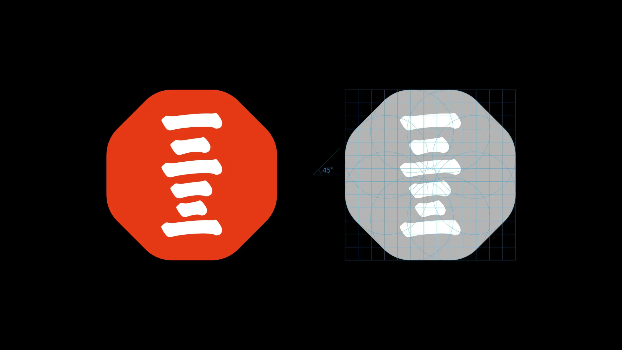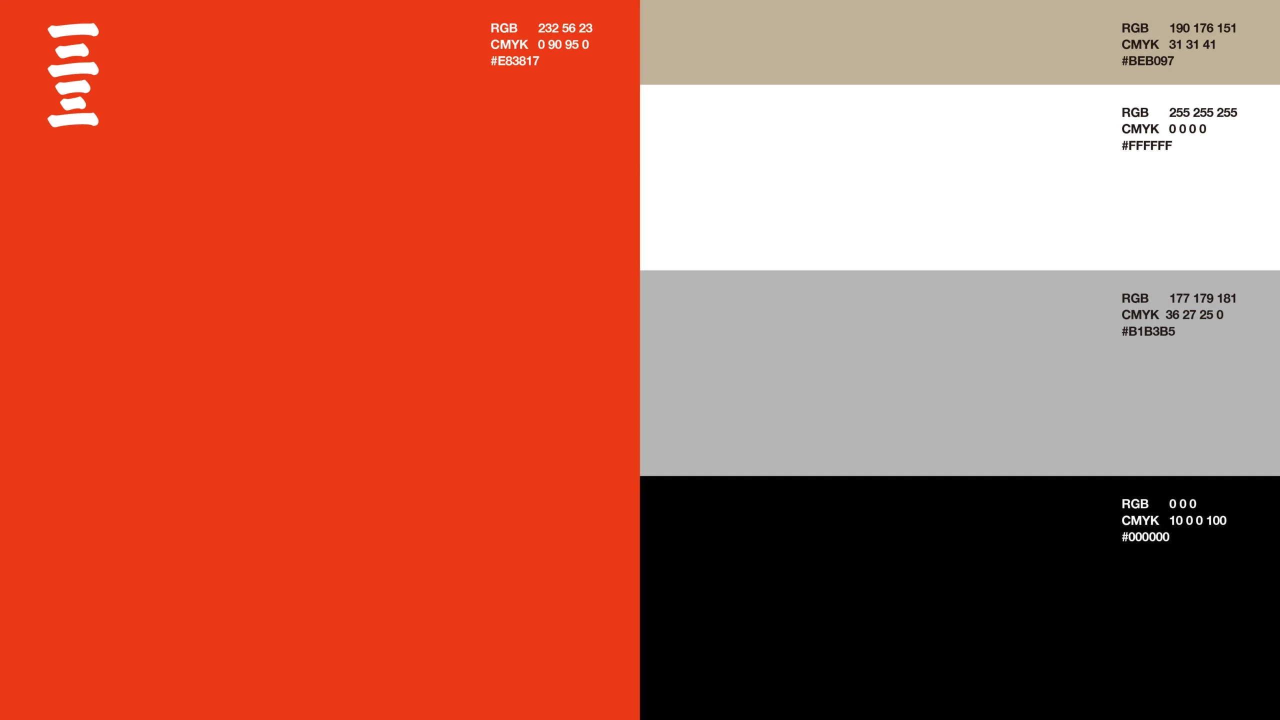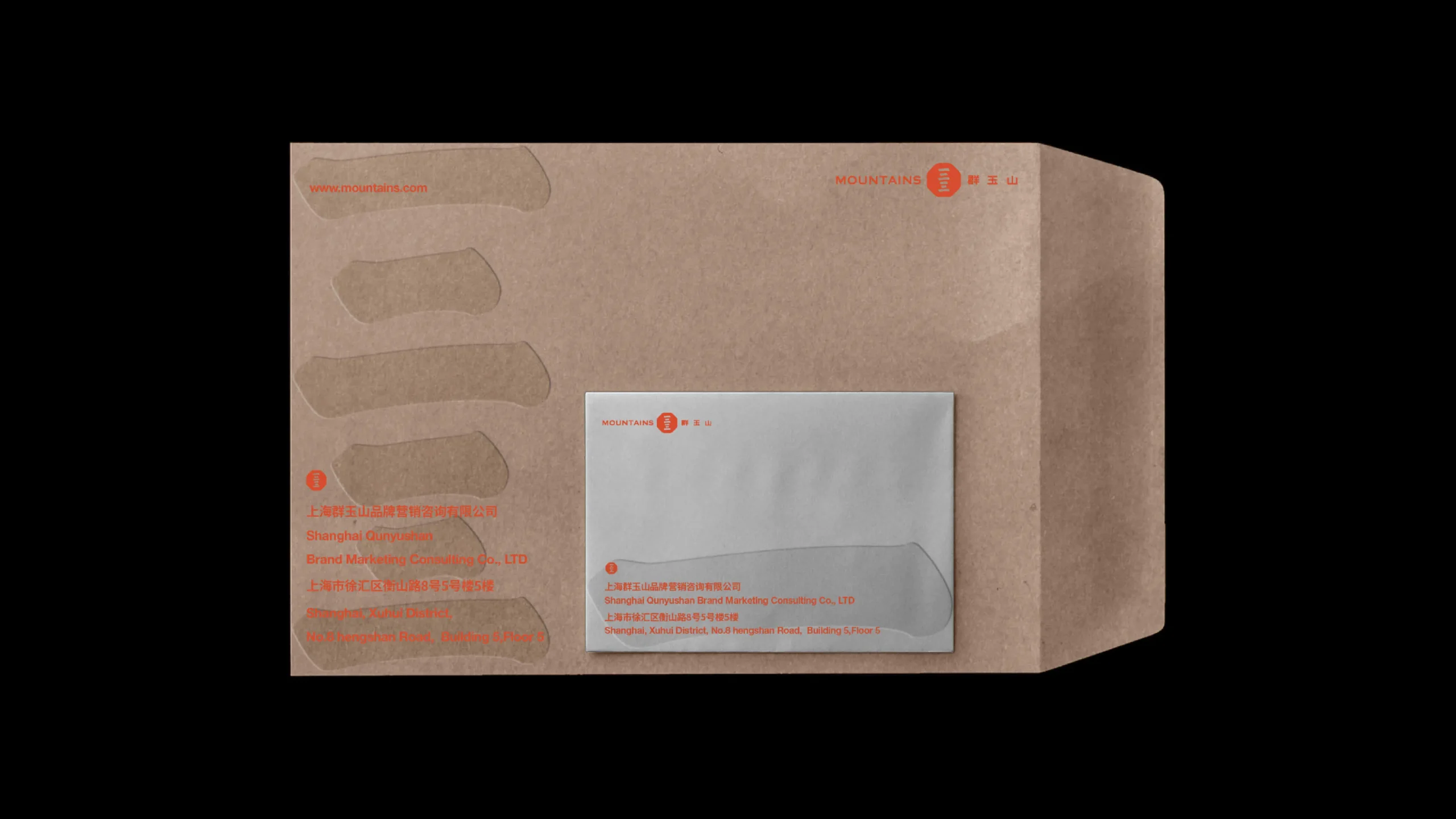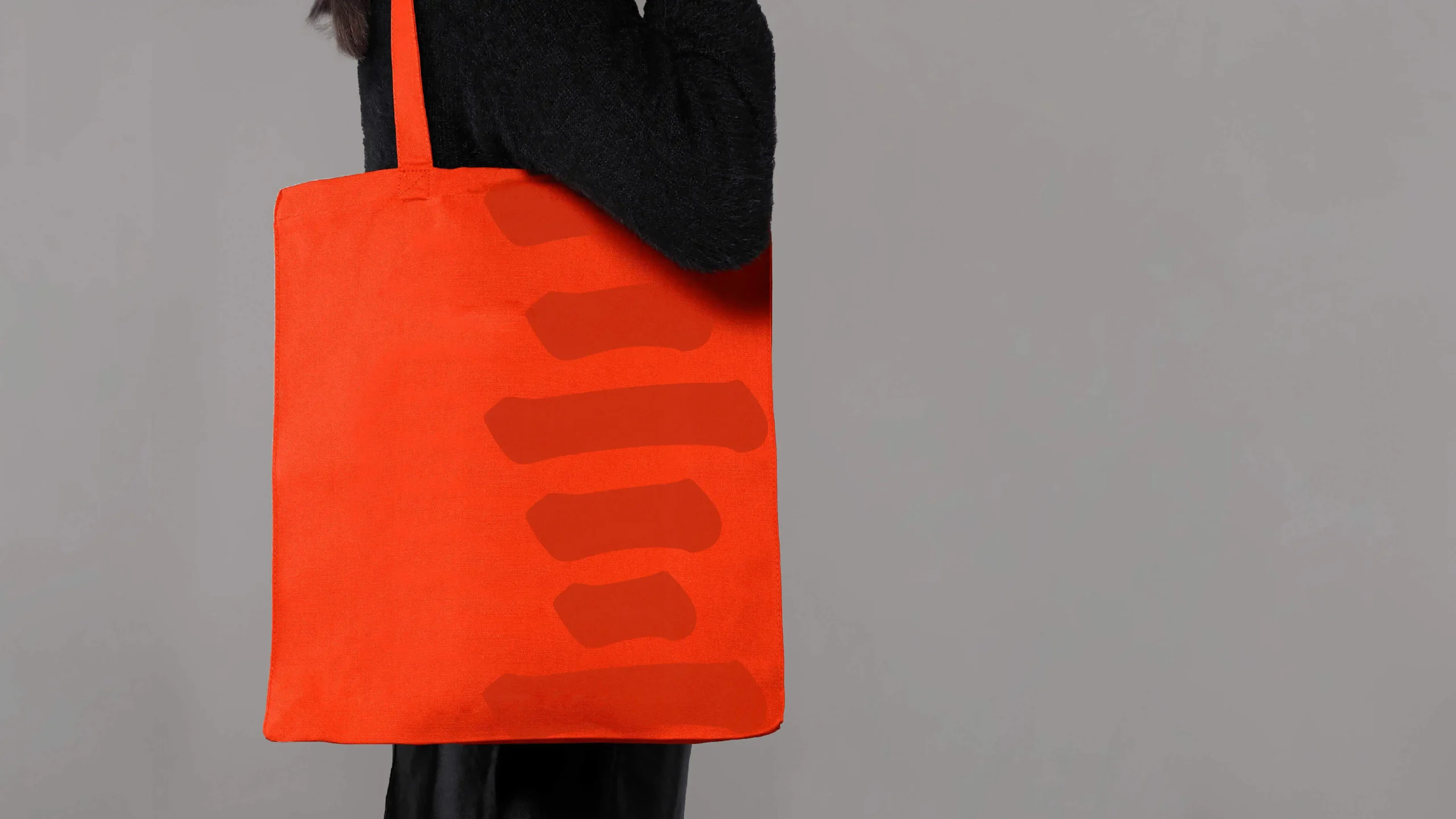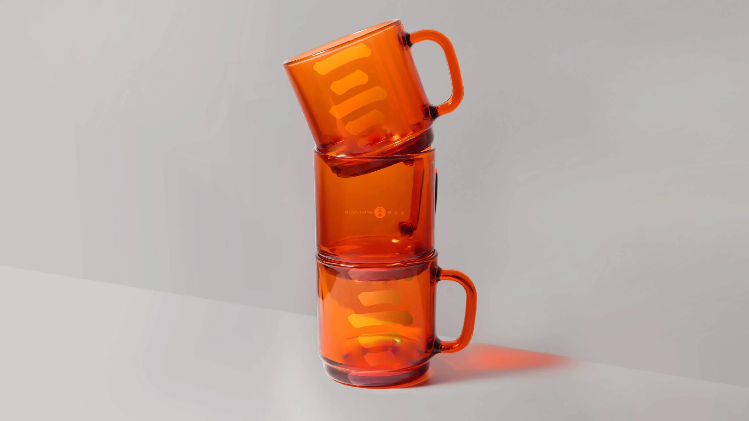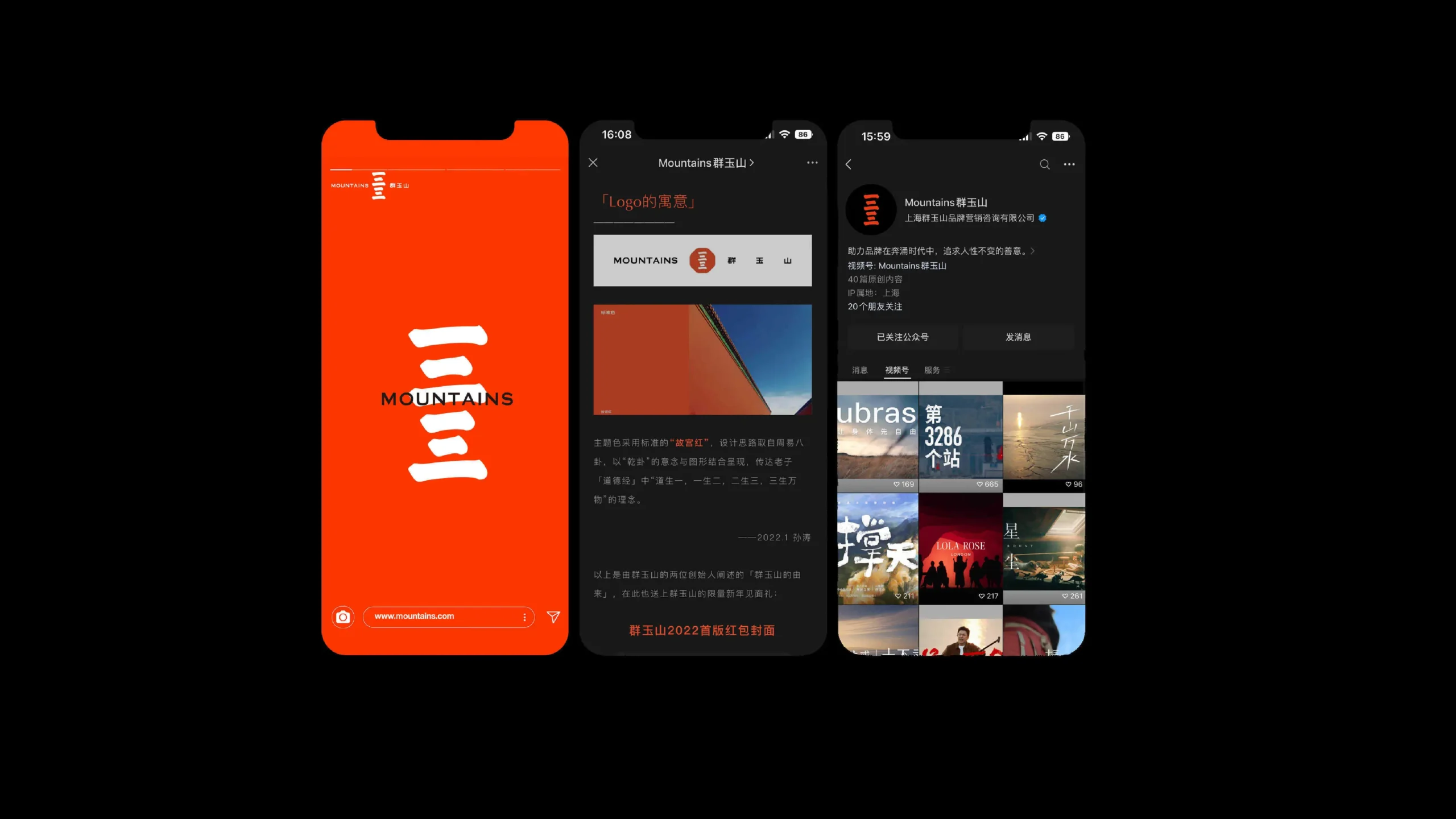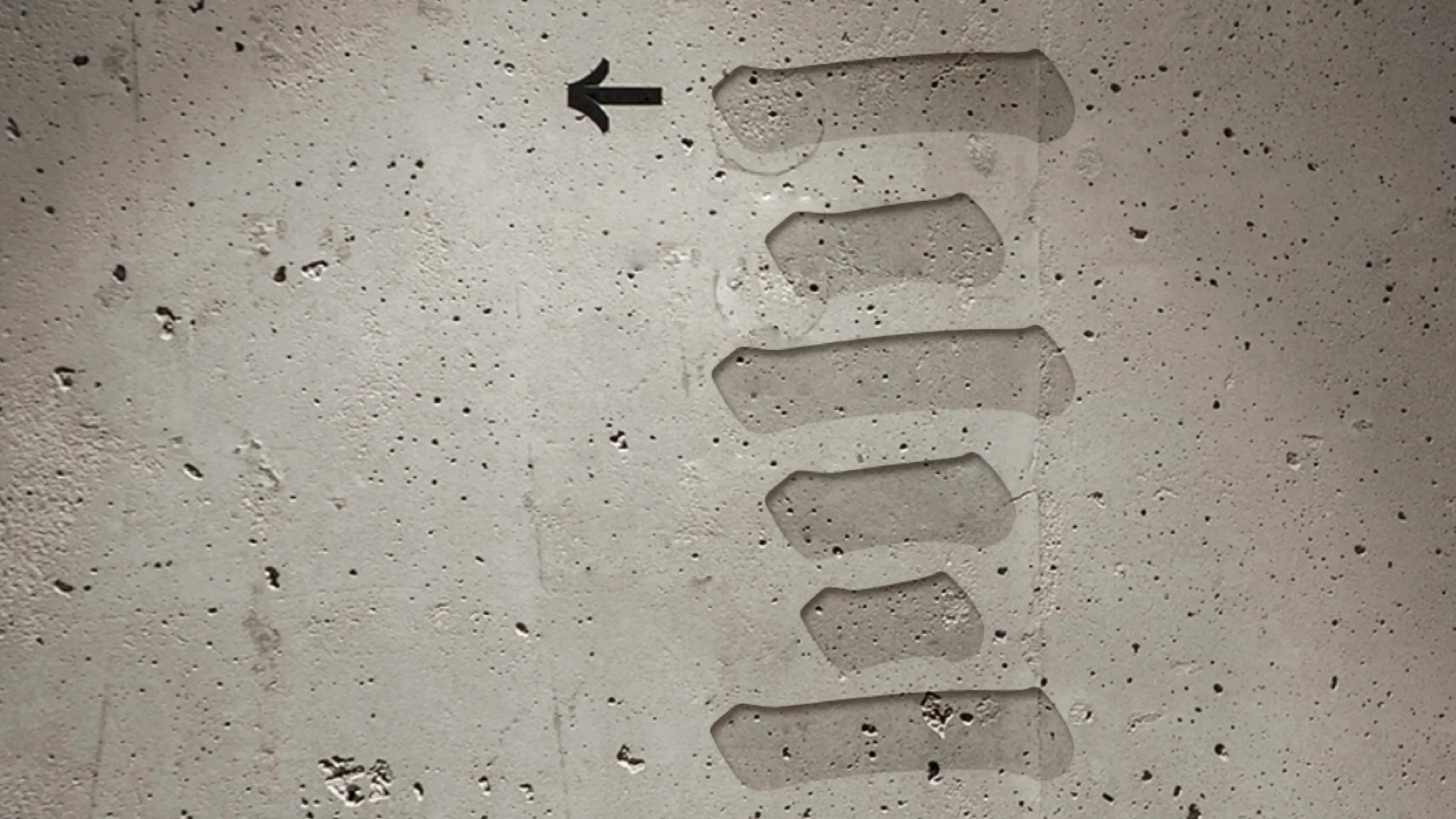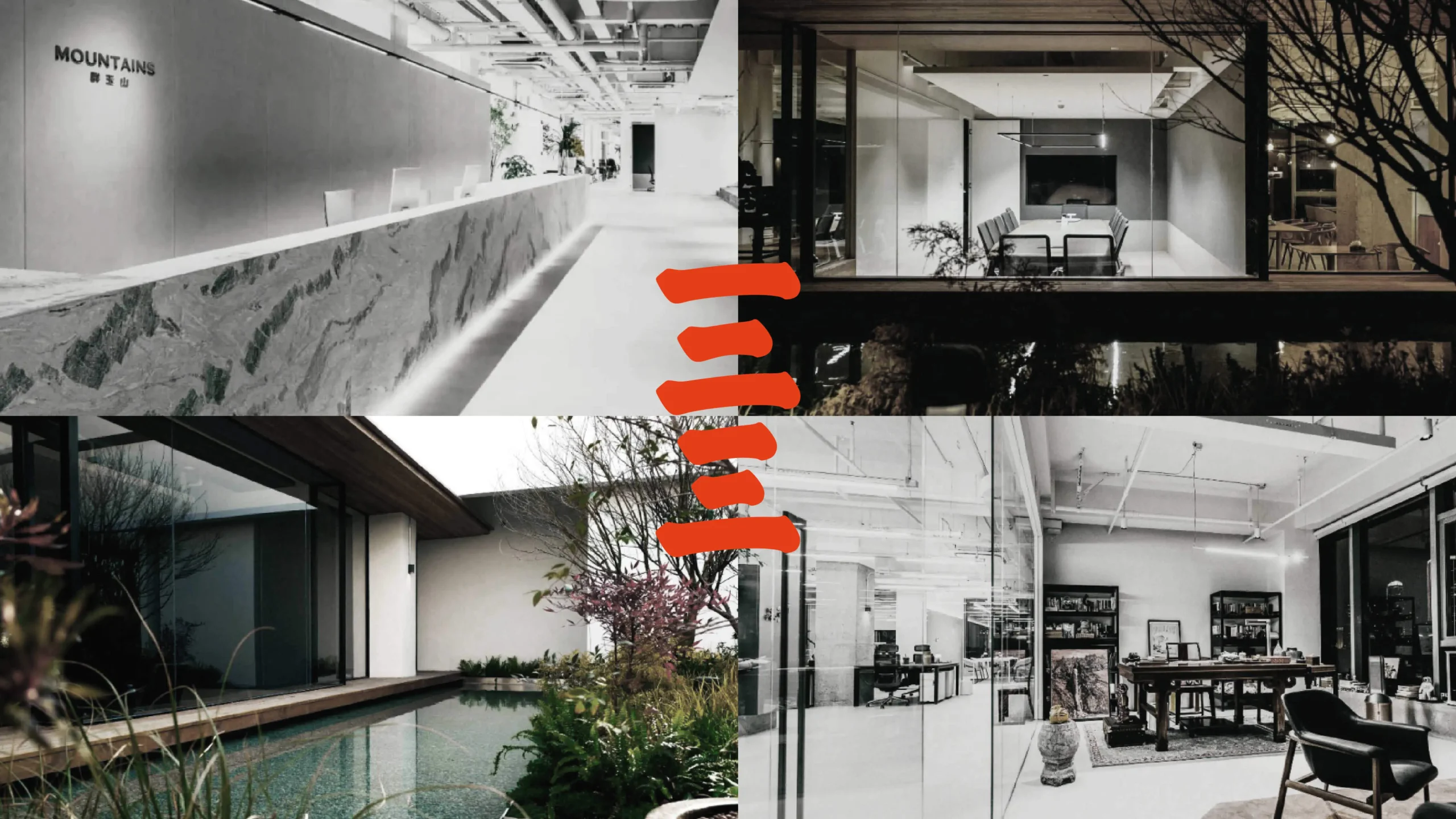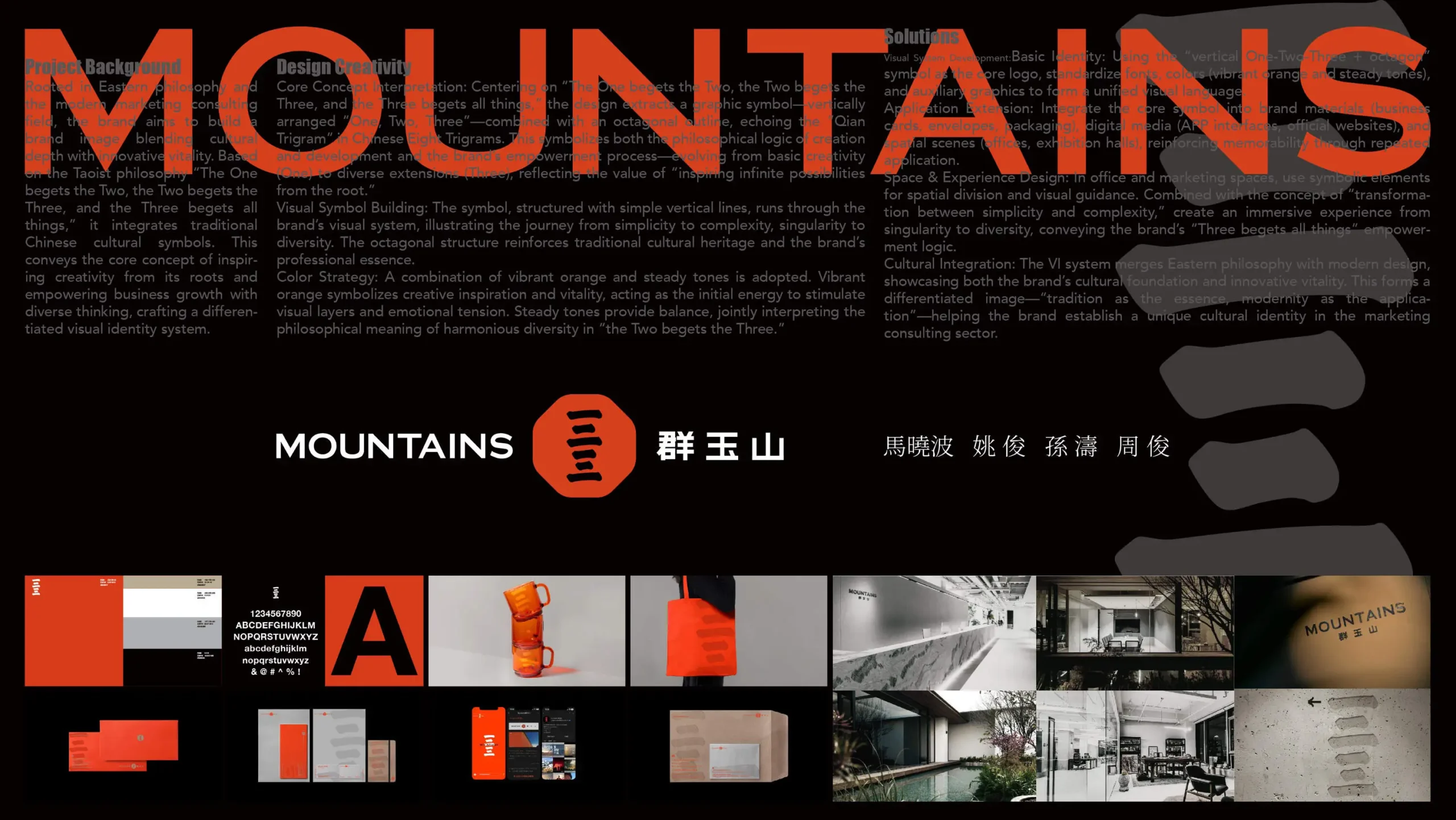
品牌以东方哲学为内核,立足现代营销咨询领域,致力于构建兼具文化深度与创新活力的品牌形象。基于 “一生二,二生三,三生万物” 的道家哲学思想,融合中国传统文化符号,传递品牌从根源激发创意、以多元思维赋能商业增长的核心理念,打造差异化的视觉识别体系。以 “一生二,二生三,三生万物” 为创意原点,提炼 “一、二、三” 纵向排列的图形符号,结合八边形外轮廓,呼应中国八卦中 “乾卦” 的形式,既象征万物起源与发展的哲学逻辑,也暗喻品牌从基础创意(一)到多元延伸(三)的赋能过程,体现 “从根源激发无限可能” 的品牌价值。符号以简洁的线条纵向排列,贯穿品牌视觉系统,传递从简单到复杂、从单一到多元的发展轨迹,同时融入八边形的稳定结构,强化传统文化底蕴与品牌的专业属性。采用活力橙与沉稳基调色搭配。活力橙象征创意灵感与生命力,如同初始能量激发视觉层次与情感张力;沉稳基调色提供平衡支撑,二者结合诠释 “二生三” 中多元和谐共存的哲学内涵。通过 VI 系统将东方哲学与现代设计结合,既展现品牌文化根基,又凸显创新活力,形成 “传统为体,现代为用” 的差异化品牌形象,助力品牌在营销咨询领域建立独特的文化识别标签。
The brand takes Eastern philosophy as its core, is based in the modern marketing consulting field, and is committed to building a brand image that combines cultural depth with innovative vitality. Based on the Taoist philosophy of “One gives birth to two, two gives birth to three, and three gives birth to all things”, and integrating traditional Chinese cultural symbols, it conveys the core concept of the brand to inspire creativity from the root and empower business growth with diverse thinking, creating a differentiated visual identity system. Taking “One gives birth to two, two gives birth to three, and three gives birth to all things” as the creative origin, the graphic symbols of “one, two, three” arranged vertically are extracted. Combined with the octagonal outer outline, it echoes the form of the “Qian Hexagram” in the Chinese Eight Trigrams. It not only symbolizes the philosophical logic of the origin and development of all things, but also implies the empowerment process of the brand from basic creativity (one) to diversified extension (three). Embody the brand value of “stimulating infinite possibilities from the root”.The symbols are arranged vertically with simple lines, running through the brand’s visual system, conveying the development trajectory from simplicity to complexity and from singularity to diversity. At the same time, the stable octagonal structure is integrated to strengthen the traditional cultural heritage and the professional attributes of the brand. The vibrant orange is paired with a calm base color. The vibrant orange symbolizes creative inspiration and vitality, just like the initial energy that stimulates visual layers and emotional tension. The steady base color provides balanced support, and the combination of the two interprets the philosophical connotation of the harmonious coexistence of diversity in “two gives birth to three”. By integrating Eastern philosophy with modern design through the VI system, it not only showcases the brand’s cultural foundation but also highlights its innovative vitality, forming a differentiated brand image of “tradition as the body and modernity as the application”, and helping the brand establish a unique cultural identification label in the field of marketing consulting.